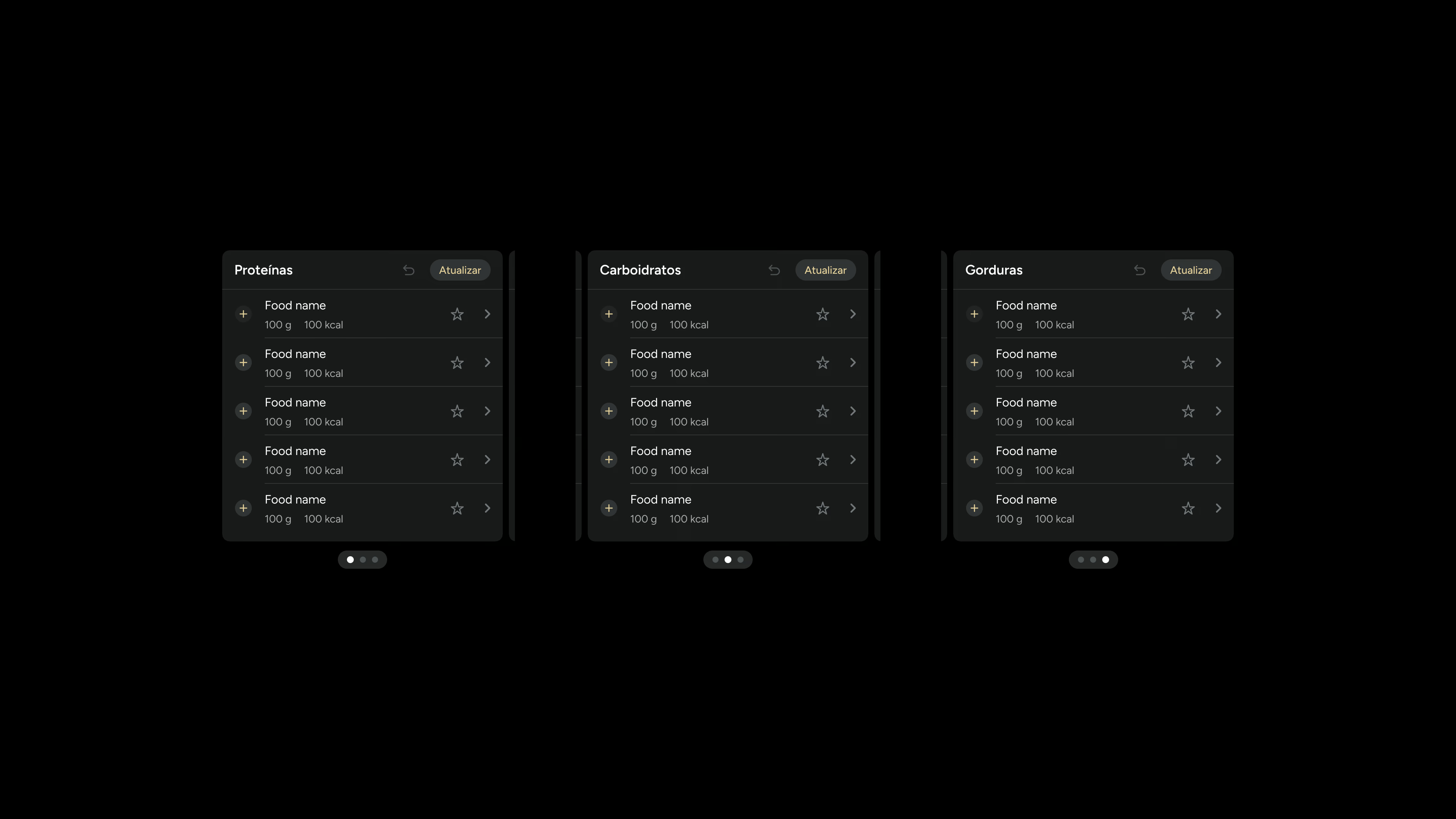
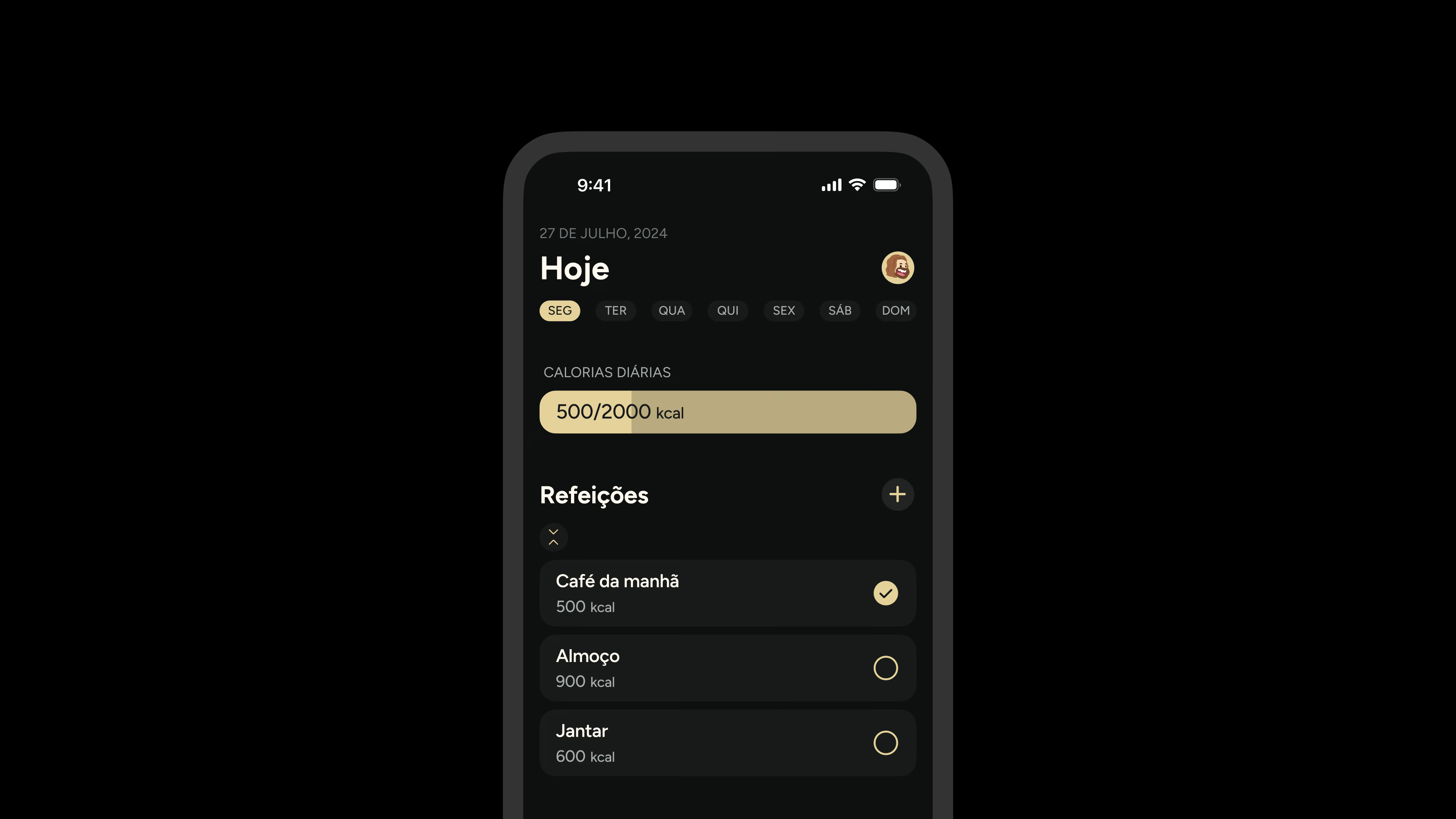
Kale Design Kit
A Figma-based design system and component library for the Kale mobile diet tracking app.
Kale Design Kit
Year
Type
Mobile
Industry
Health & Wellness
Scope
UI Kit
Design System
Component Library
Prototype
Resources
Figma file→Overview
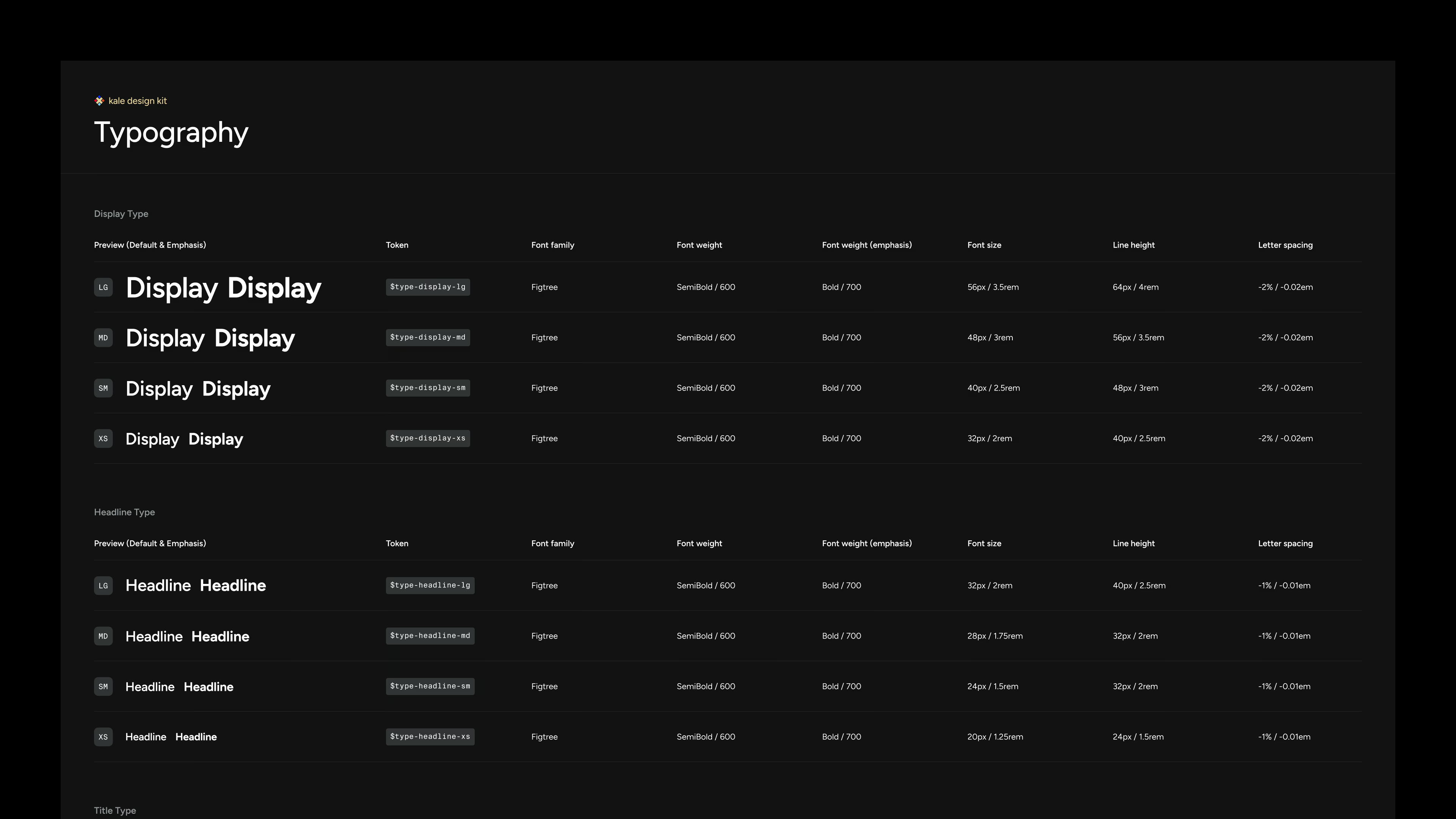
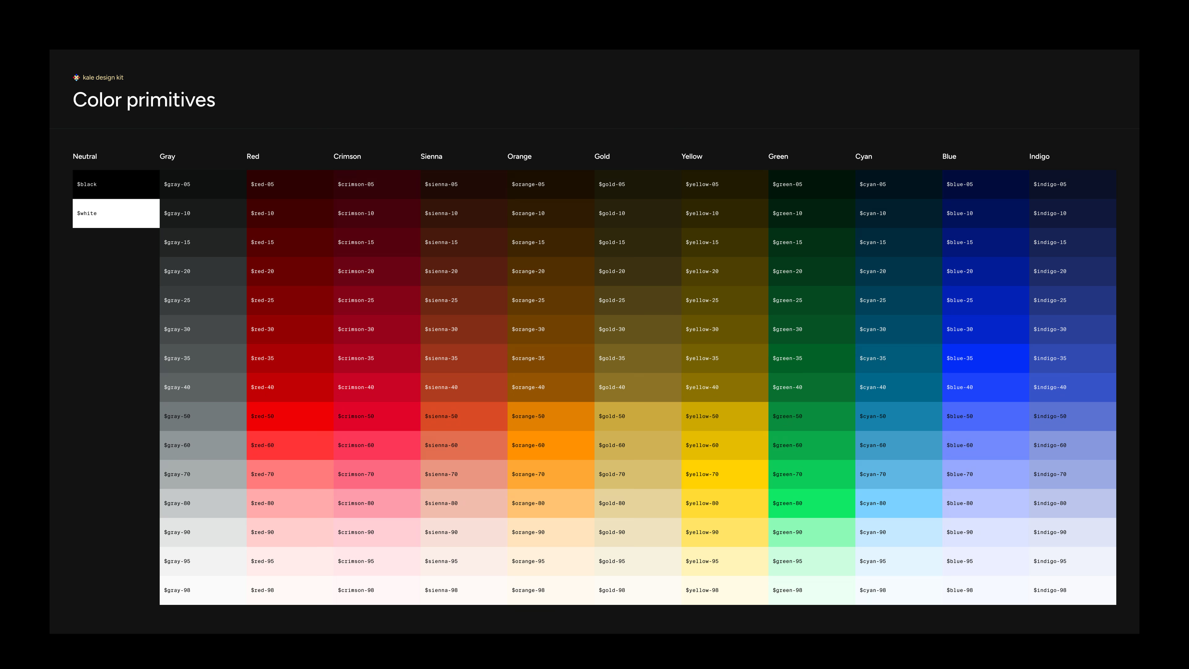
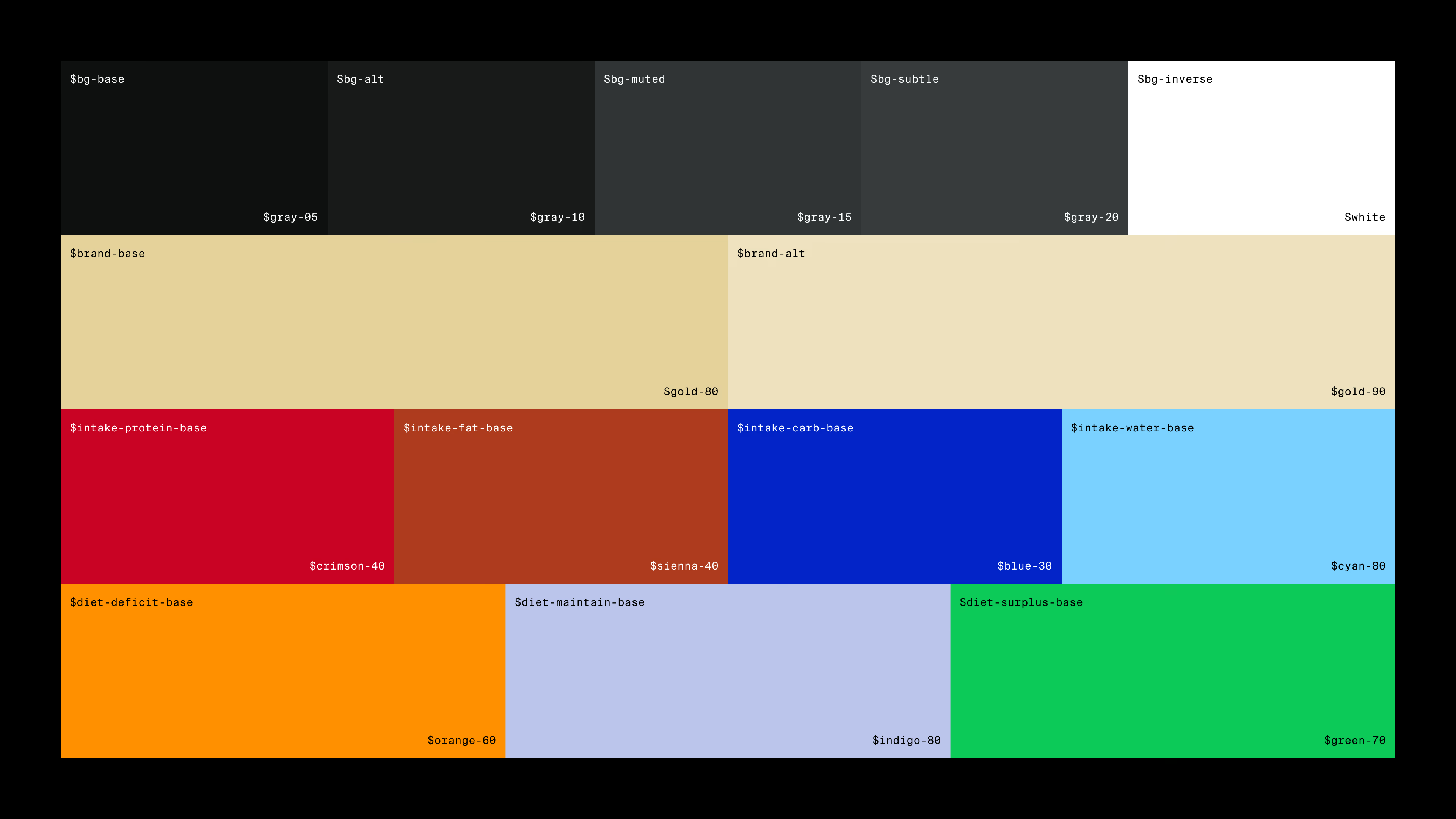
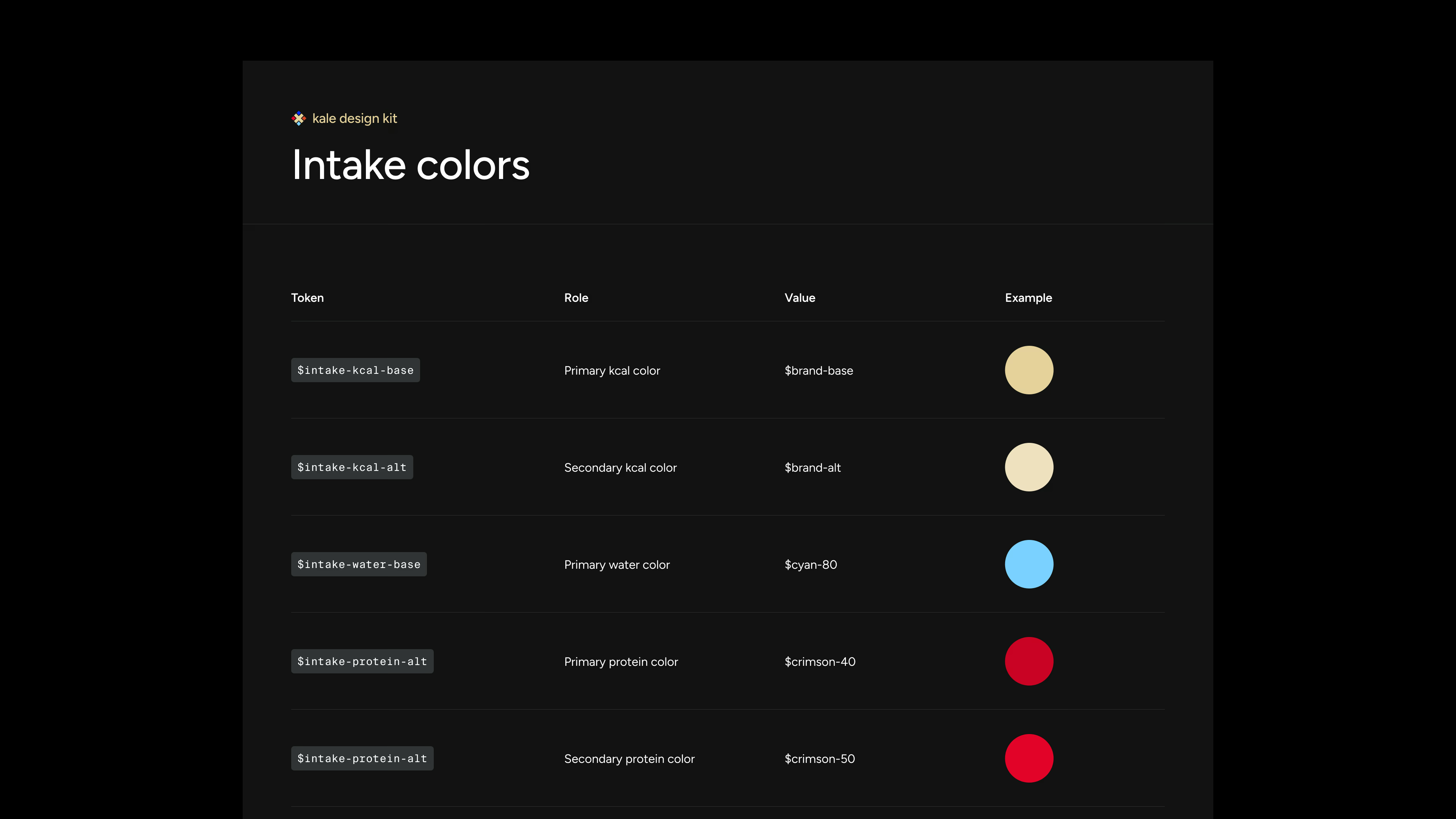
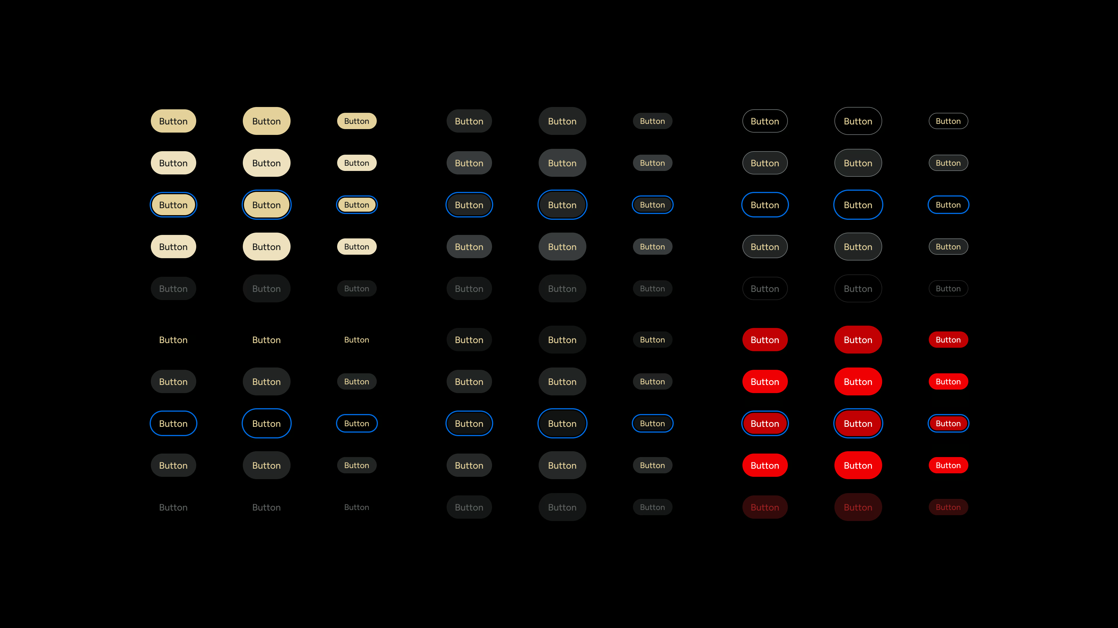
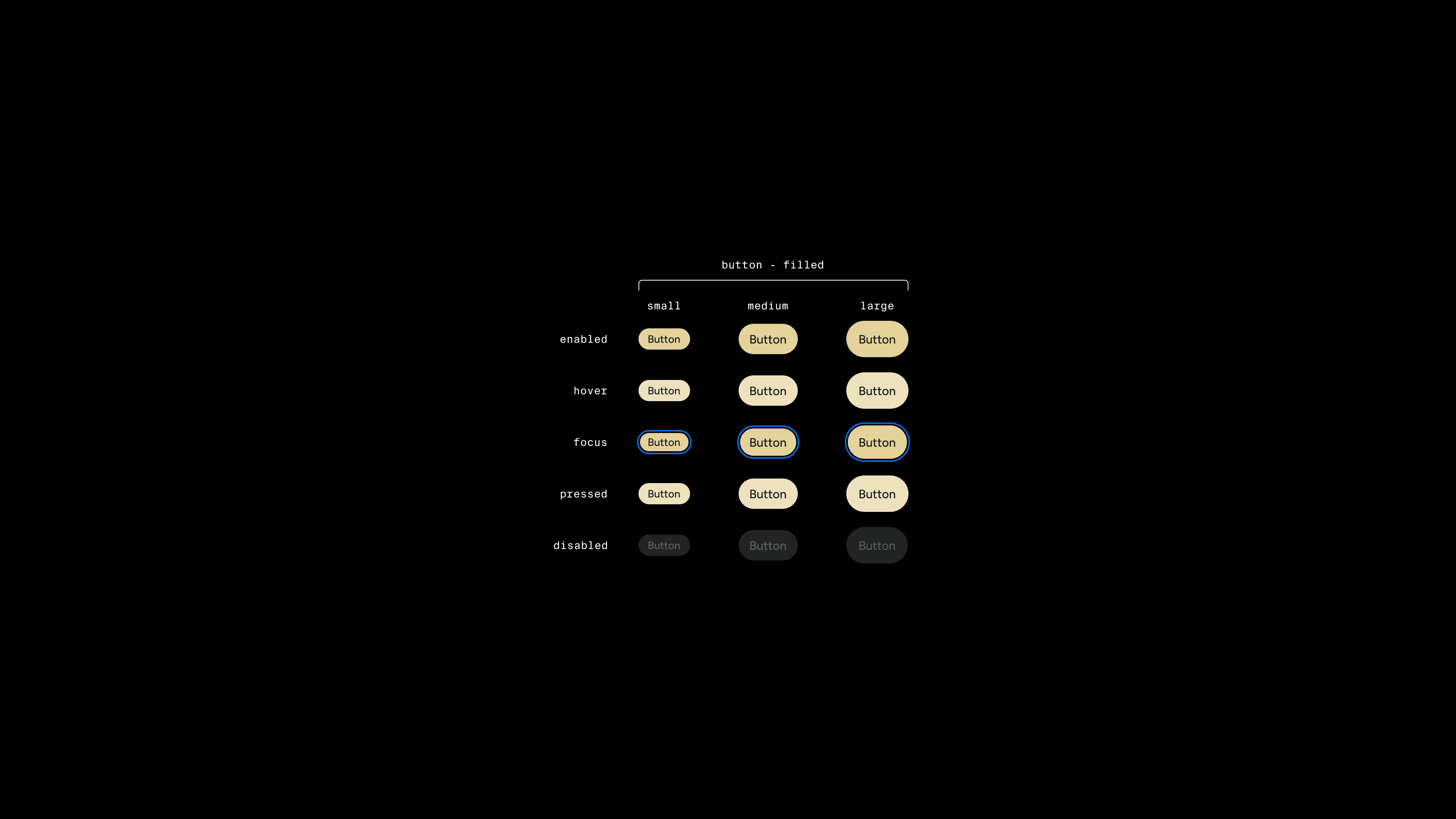
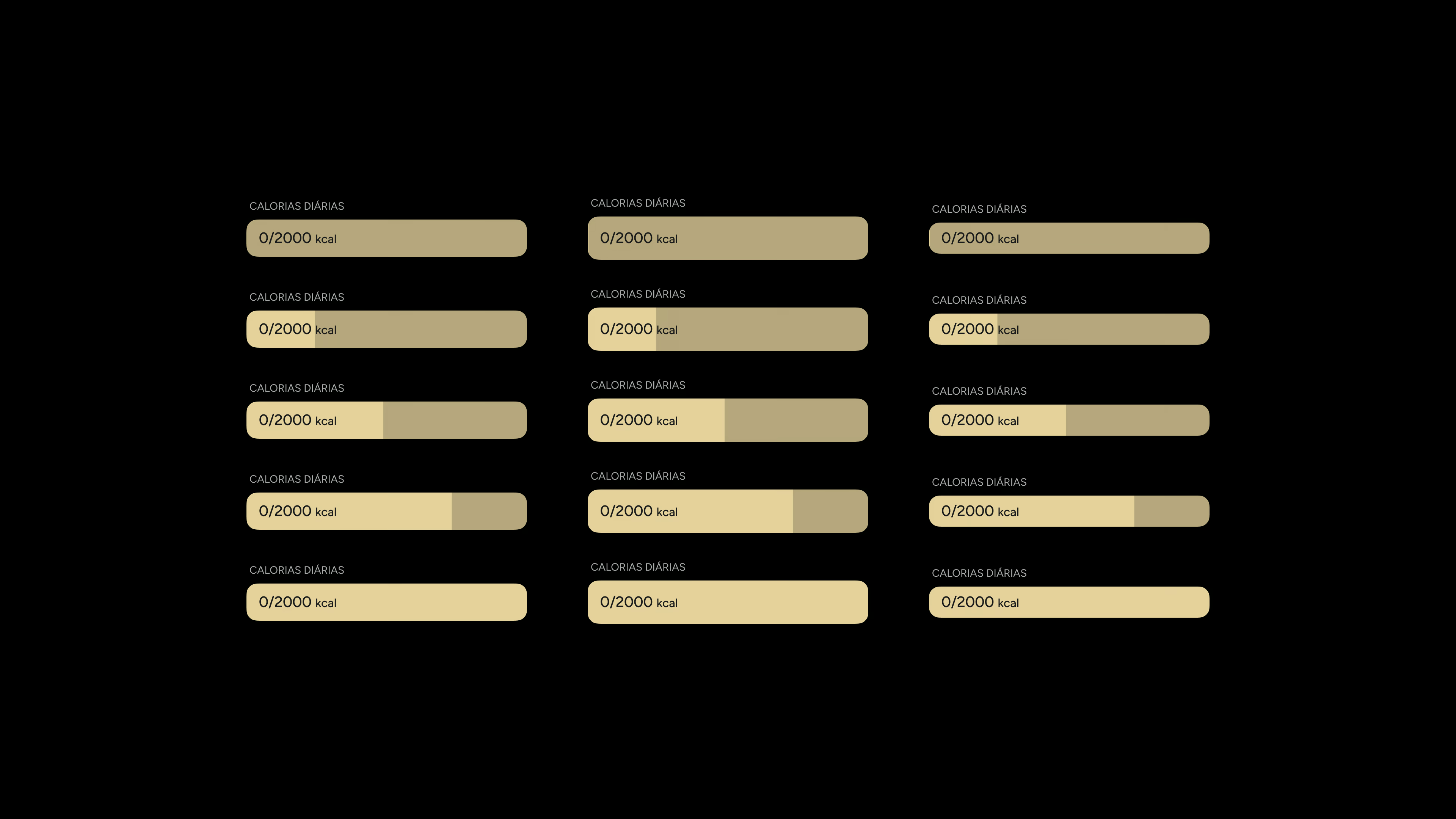
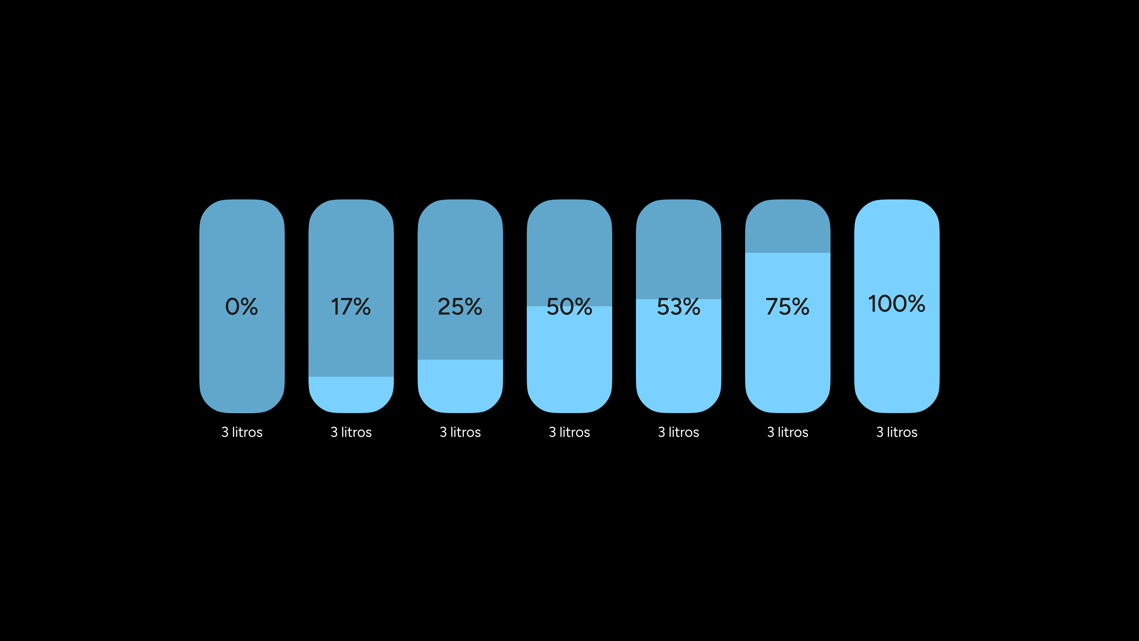
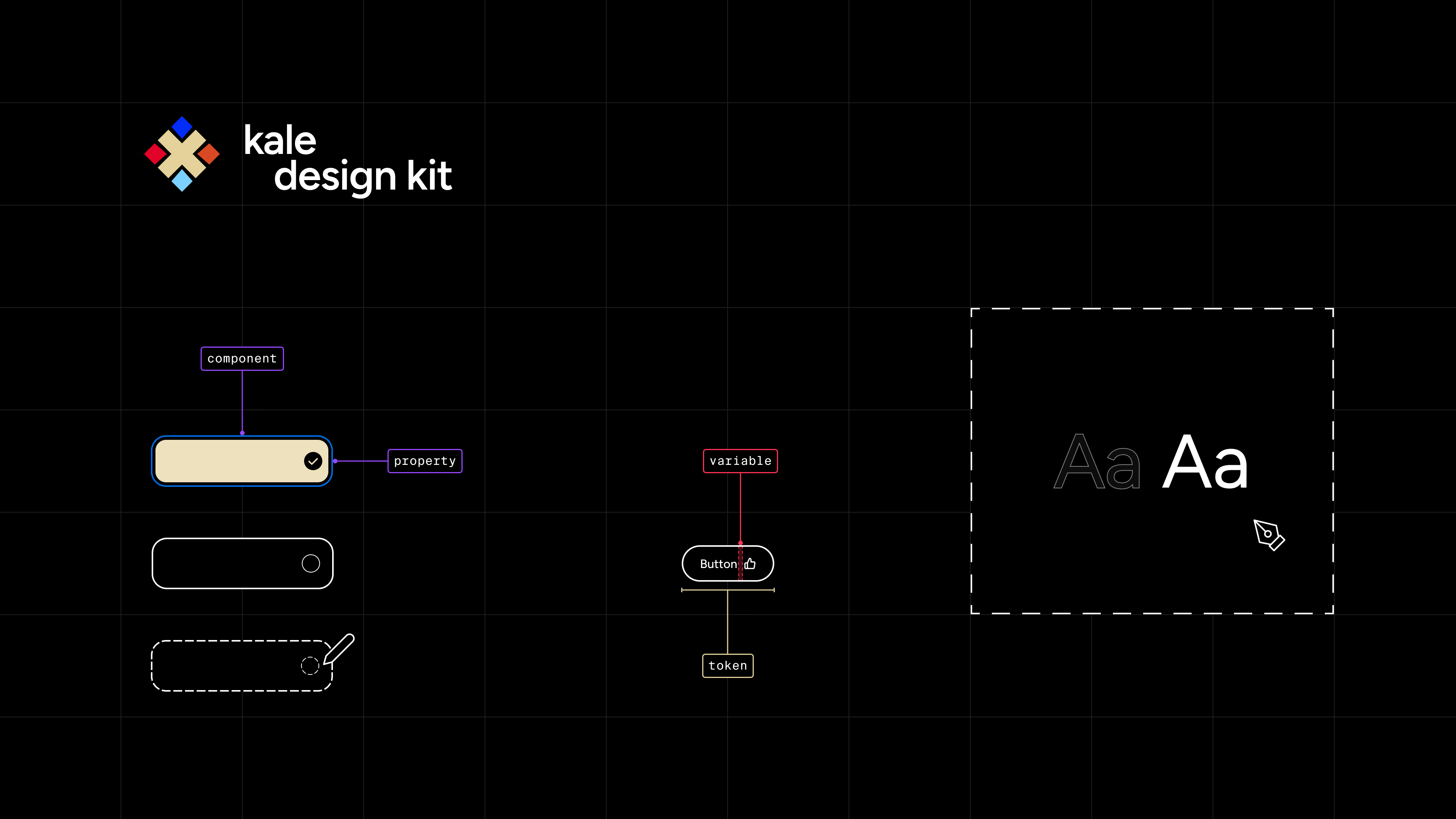
The Kale Design Kit provides a consistent and scalable foundation inside Figma, defining the core components and interaction patterns that shape the product’s interface.
It was created alongside the Kale app itself, using Figma variables and component as the project evolved. Rather than treating the UI kit as a separate artifact, it grew directly from building real screens, flows and prototypes.
Although the project focuses on the design layer rather than a fully implemented design system in code, it was shaped by real product constraints.
Components were designed with a constant trade-off in mind: being flexible enough to support different use cases without adding unnecessary complexity. The key goal was keeping the library reusable and scalable, without letting it become bloated or difficult to maintain.
Several established design systems were used as reference throughout the project, mainly to compare how different teams solve similar component problems.
These references helped guide decisions around structure, abstraction and where flexibility actually adds value. Main influences included Primer (GitHub), HIG (Apple), Material Design (Google), Carbon (IBM), and Stacks (Stack Overflow).
This approach proved useful in the long run when the project went through major changes in branding, assets, and typography.
Centralizing decisions through components and variables made it easier to iterate quickly without having to revisit or rebuild large parts of the UI, while still preserving consistency and long-term maintainability.