Constrentin
Constrentin is a real estate developer focused on high-end coastal residential projects in southern Brazil.
Constrentin
Year
Type
Website
Industry
Real Estate
Scope
Digital Design
UI/UX
Web Development
CMS
Overview
Constrentin has worked in construction for more than a decade and now specializes in high-end residential developments along the Paraná coast.
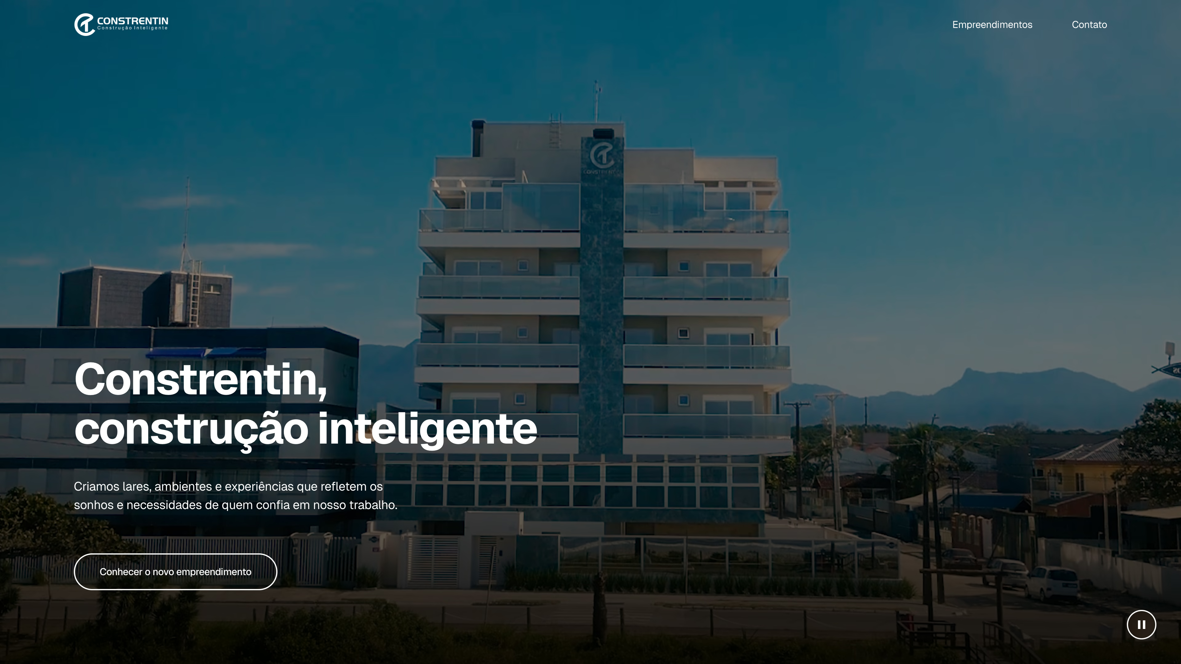
The website redesign gave the company one place to bring together completed projects and promote upcoming launches and units still for sale, all under the Constrentin name.
I designed and developed the website, including a CMS for publishing new development pages and updating existing ones.
The result was a richer presentation of each project, with more detailed technical information and a wider range of photography. Behind it, a modular structure lets pages go live with what is available at the time and expand as new content comes in.
01. Building the company's portfolio
A fragmented starting point
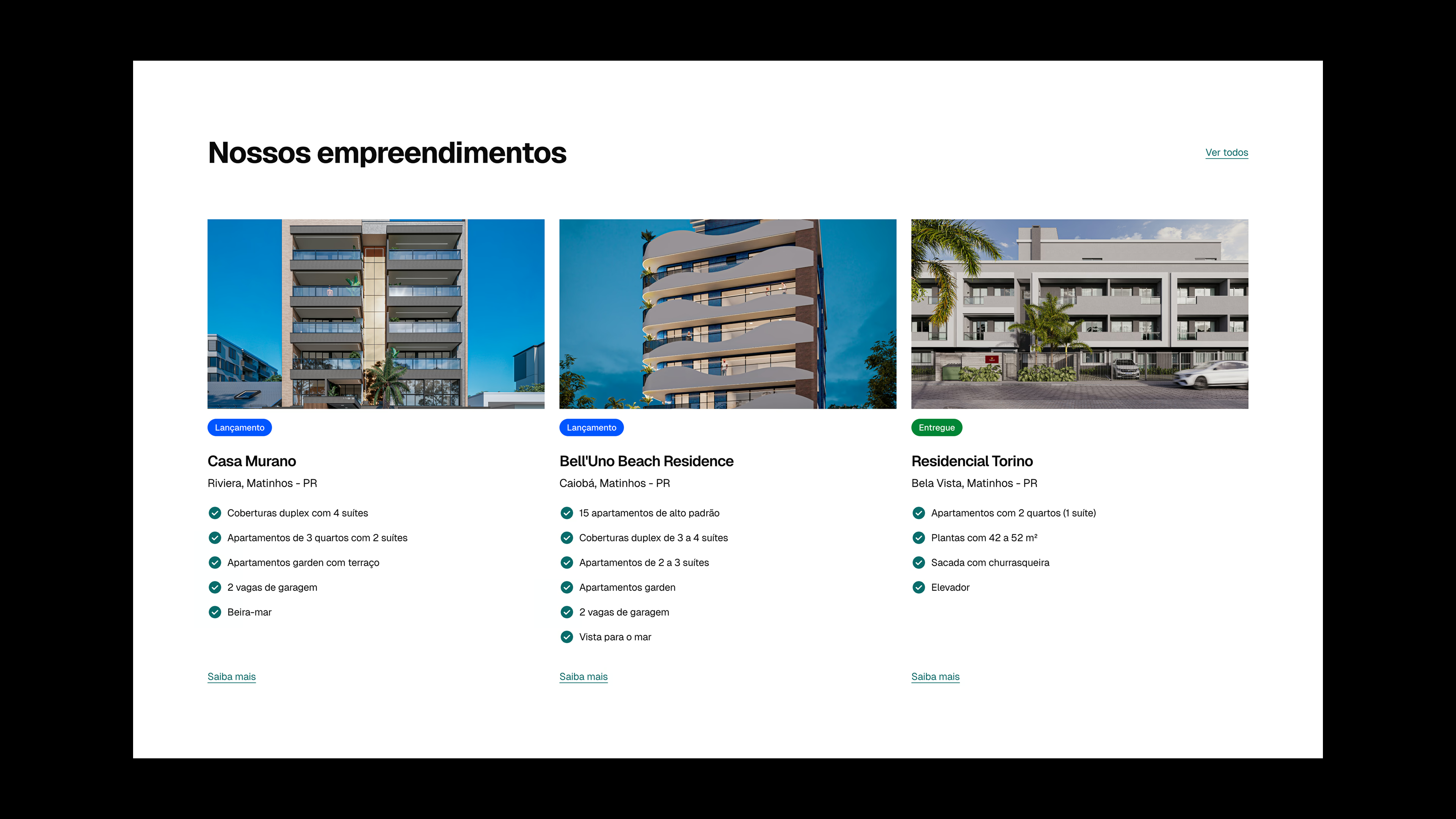
Constrentin’s previous website worked mostly as a gateway, directing visitors to separate landing pages for each development, often hosted on their own domain or subdomain. The redesign brought those projects back into the company’s own website, creating a centralized portfolio where visitors can explore all of them in more depth.
A shared structure
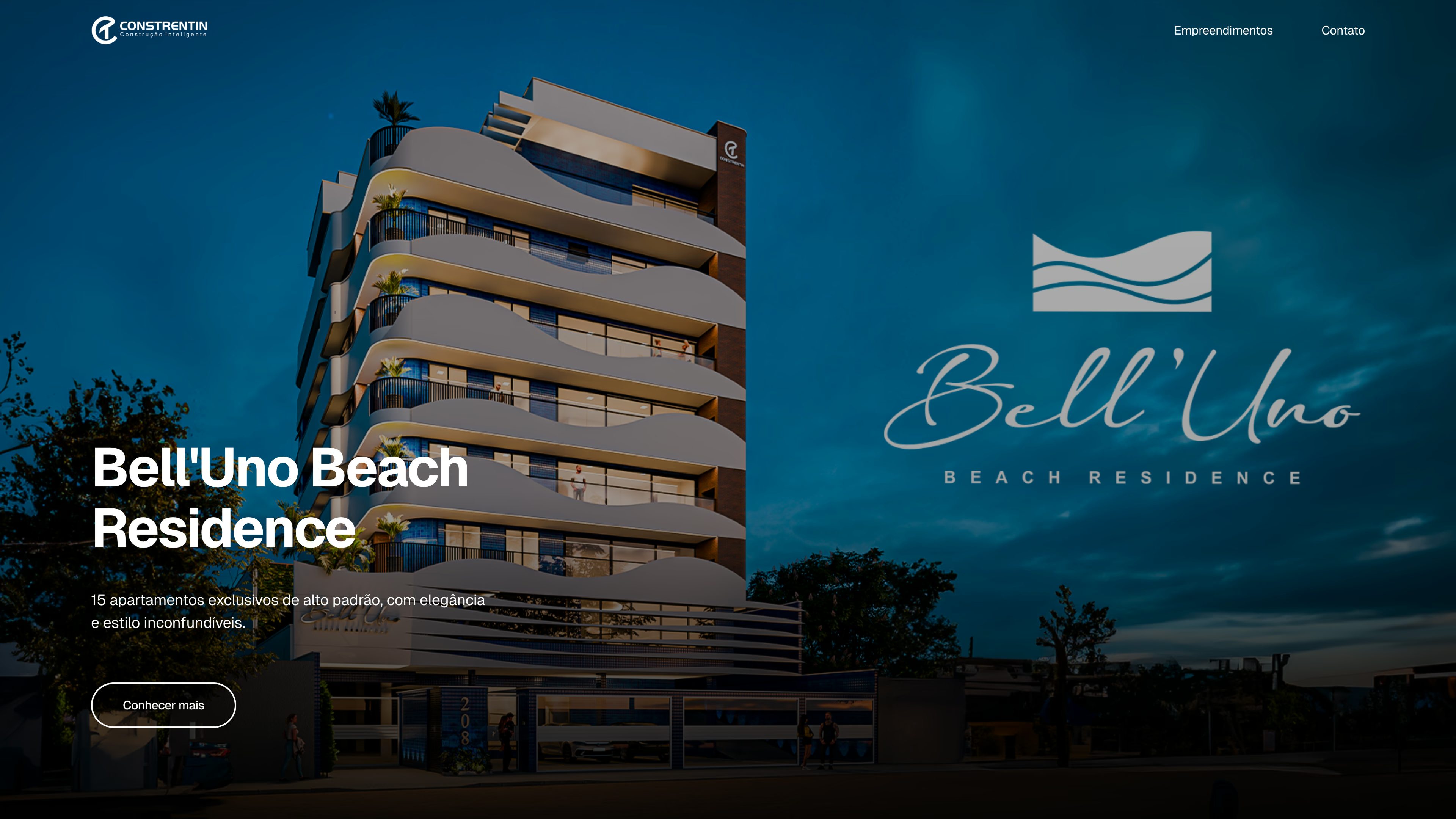
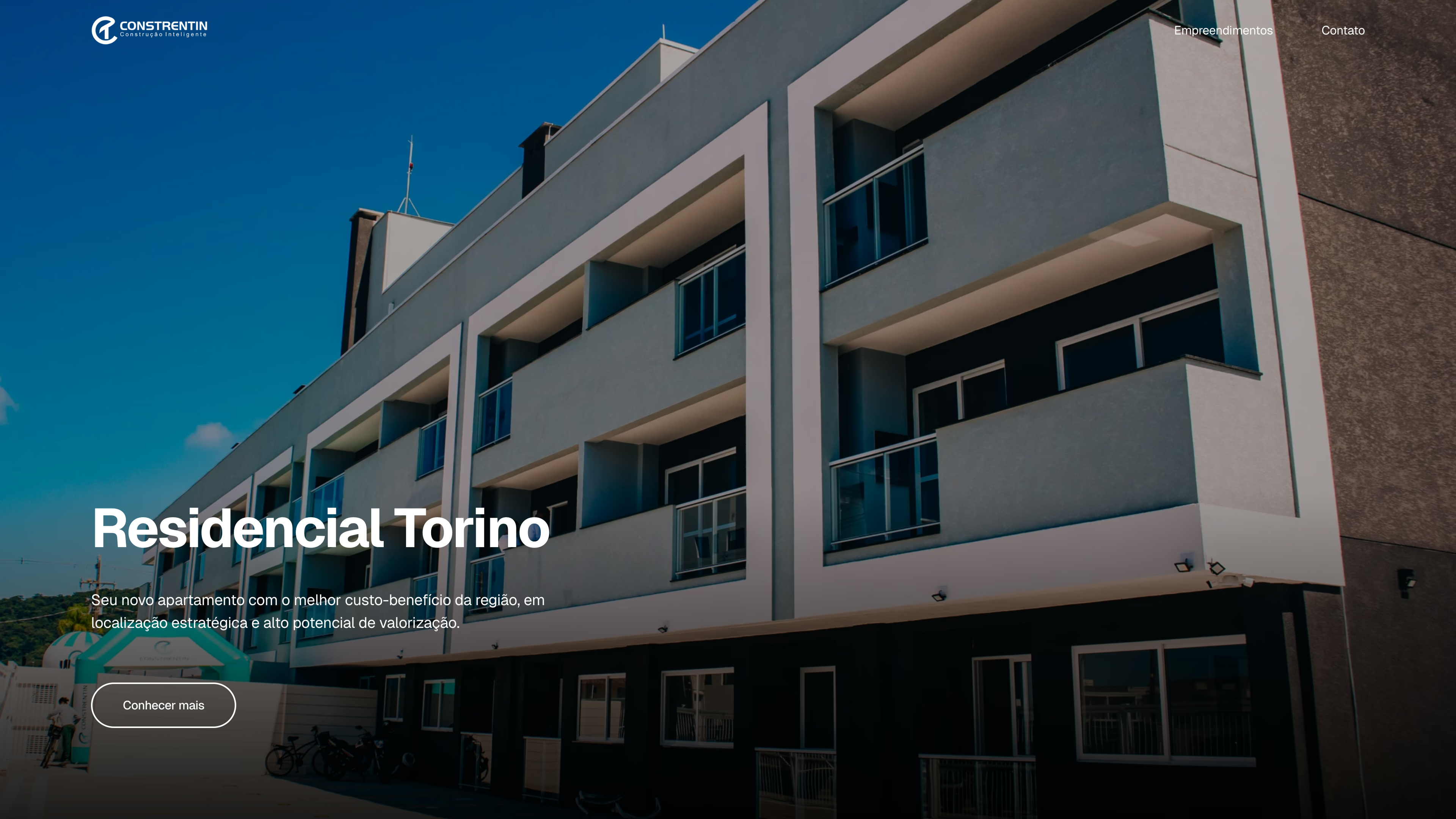
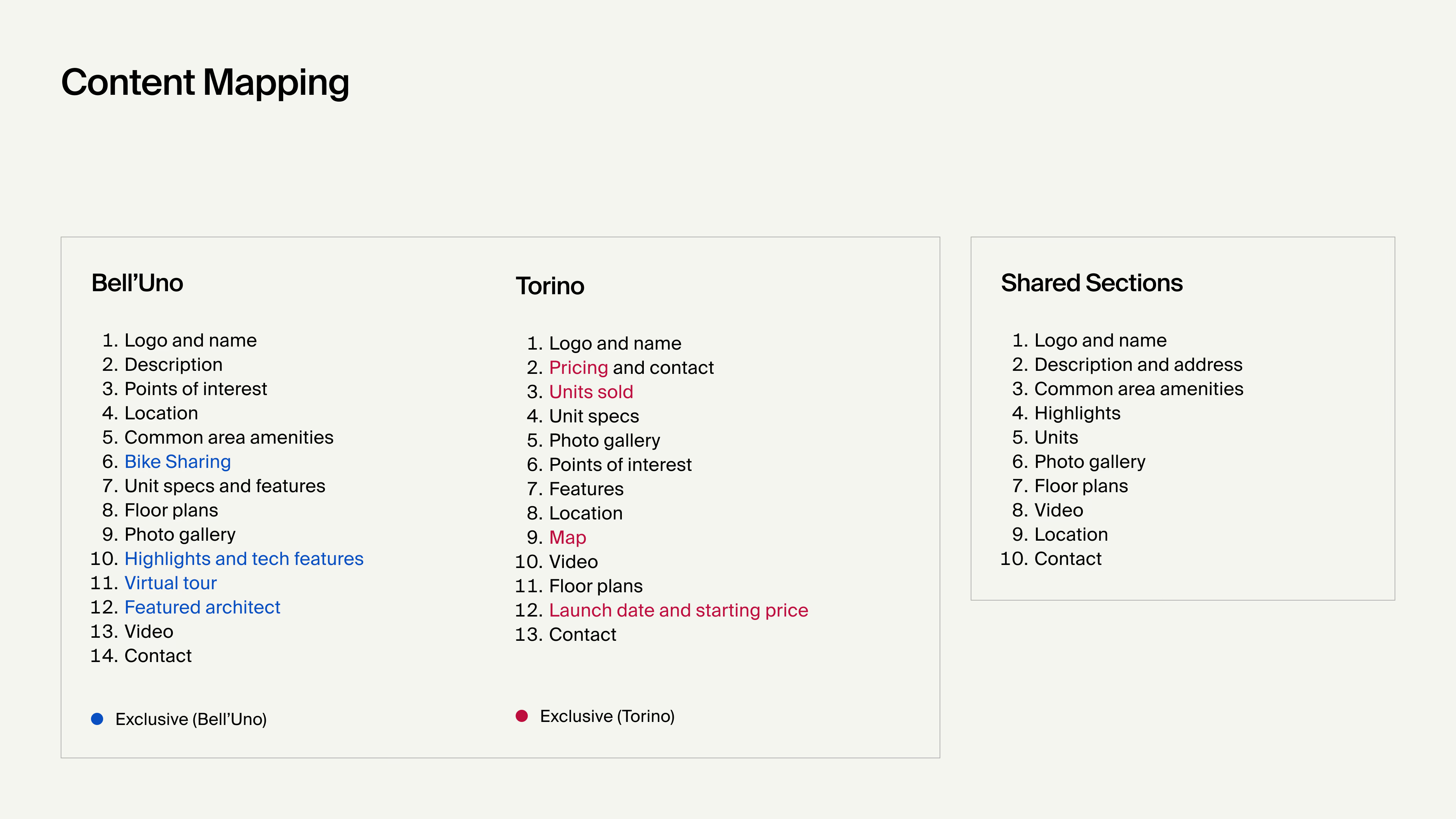
Discovery began with a side-by-side comparison of two projects chosen for their different market positioning. Bell’Uno was the company’s most recent development at the time and came with far more material to work with, while Torino was an earlier, simpler one.
Although they covered many of the same topics, the information was organized differently. Some sections were grouped together in one and split apart in the other, while certain sections appeared only in one set of materials.
The mapping separated what all developments needed to include from what was specific to a single project. That became the basis for a structure that could feel consistent across the portfolio without forcing every page to carry the same content.
Modular templates
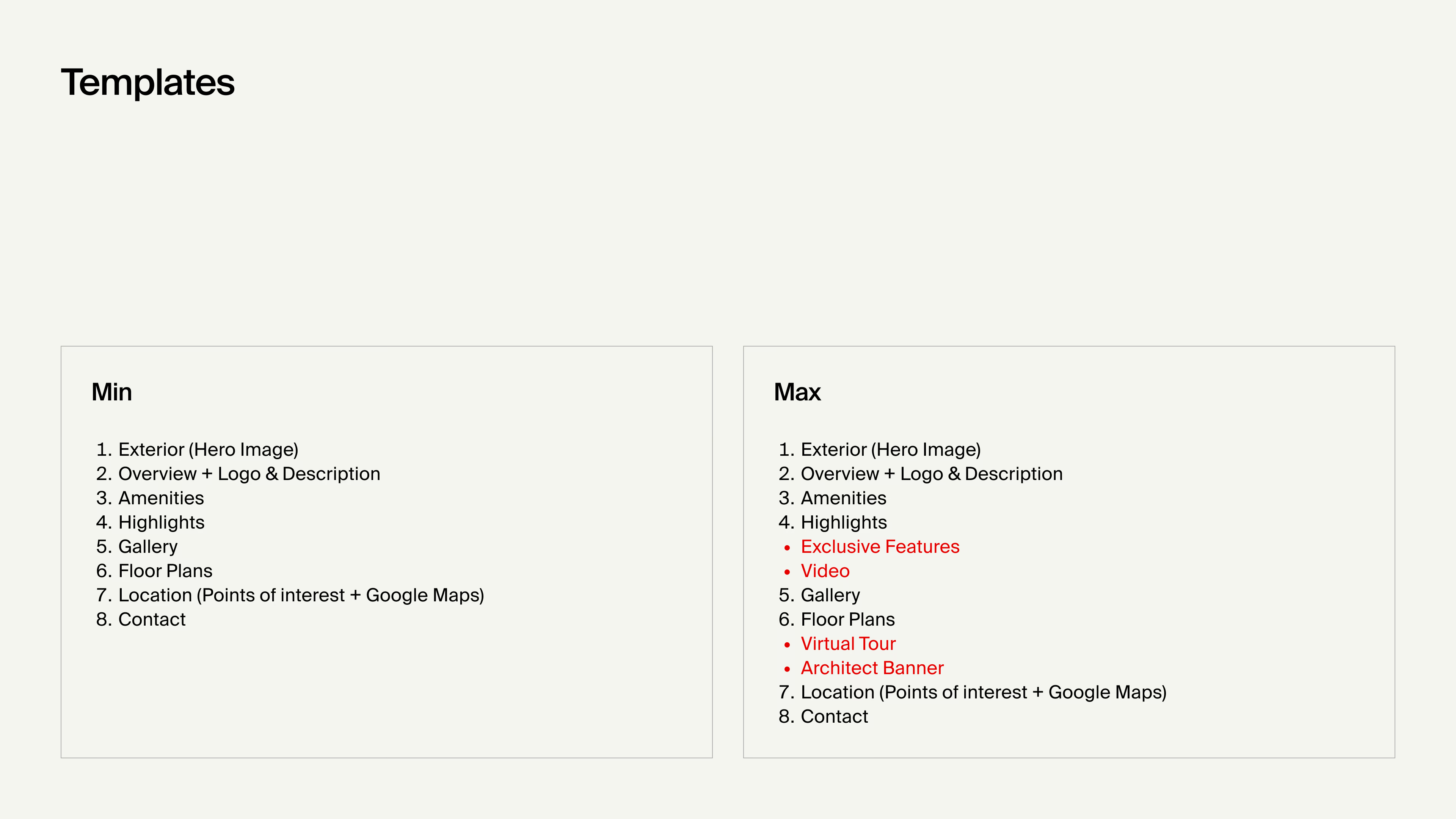
Two versions of the page emerged from the comparison: one with only the essentials and another covering the full range of sections the system might need to support.
The layout was not treated as a fixed sequence of blocks. Optional sections had their own place, allowing projects to start simple and expand over time as more content became available.
02. Bringing each project’s identity into the platform
The brand’s role
Each development already had its own brand language, shaped by its commercial booklet and sales materials. The question was not whether that identity should appear on the website, but how much of it should carry through.
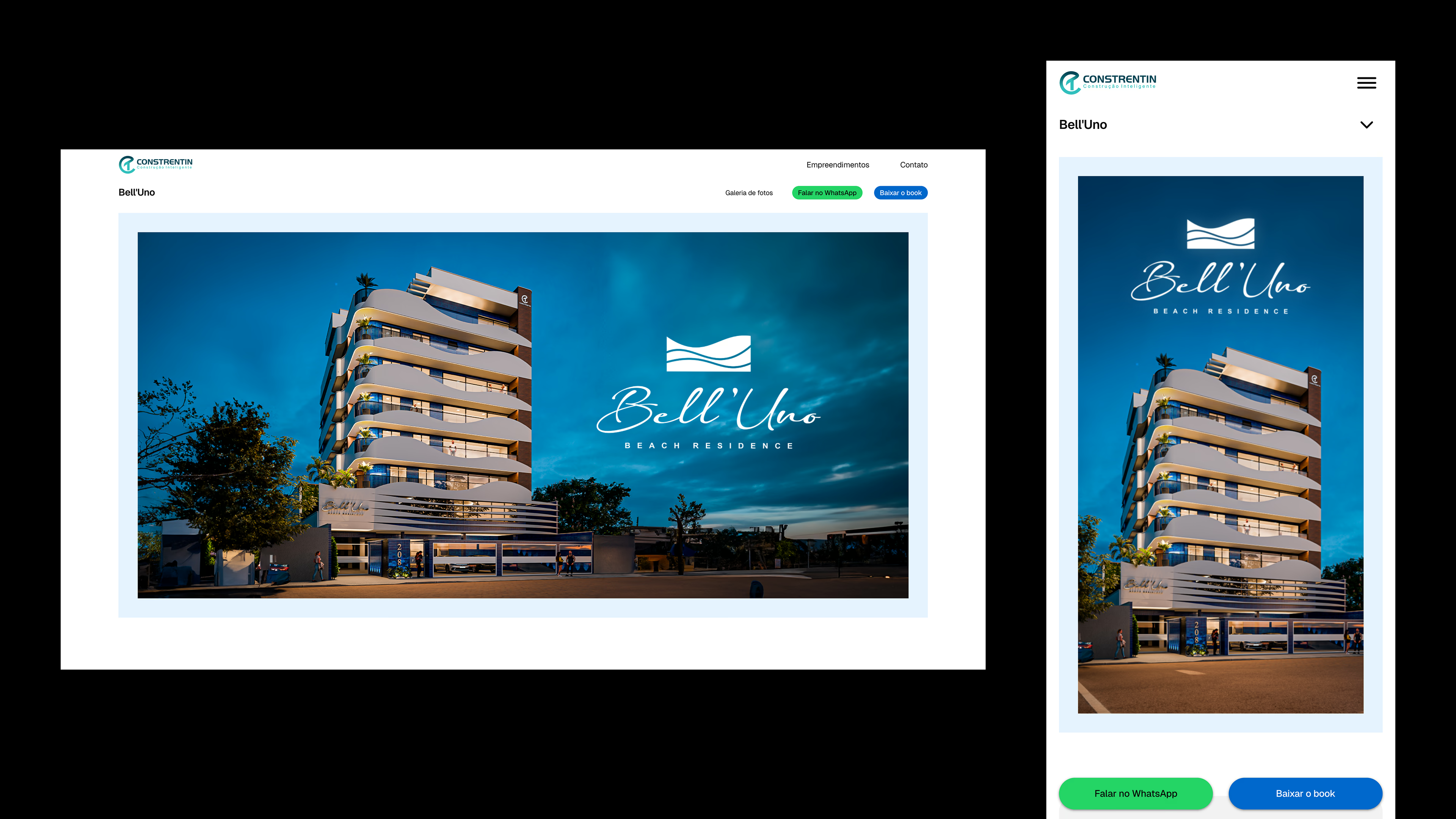
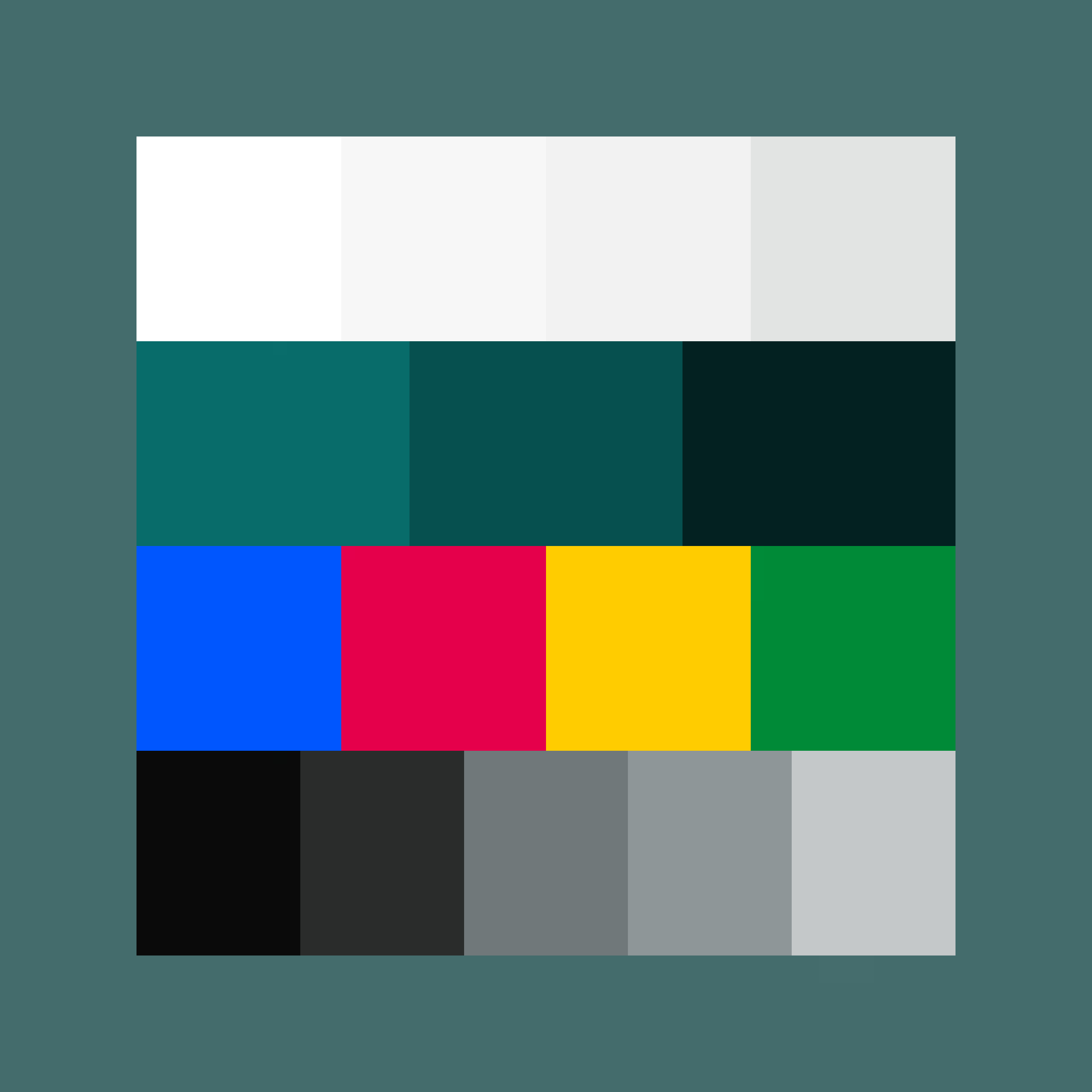
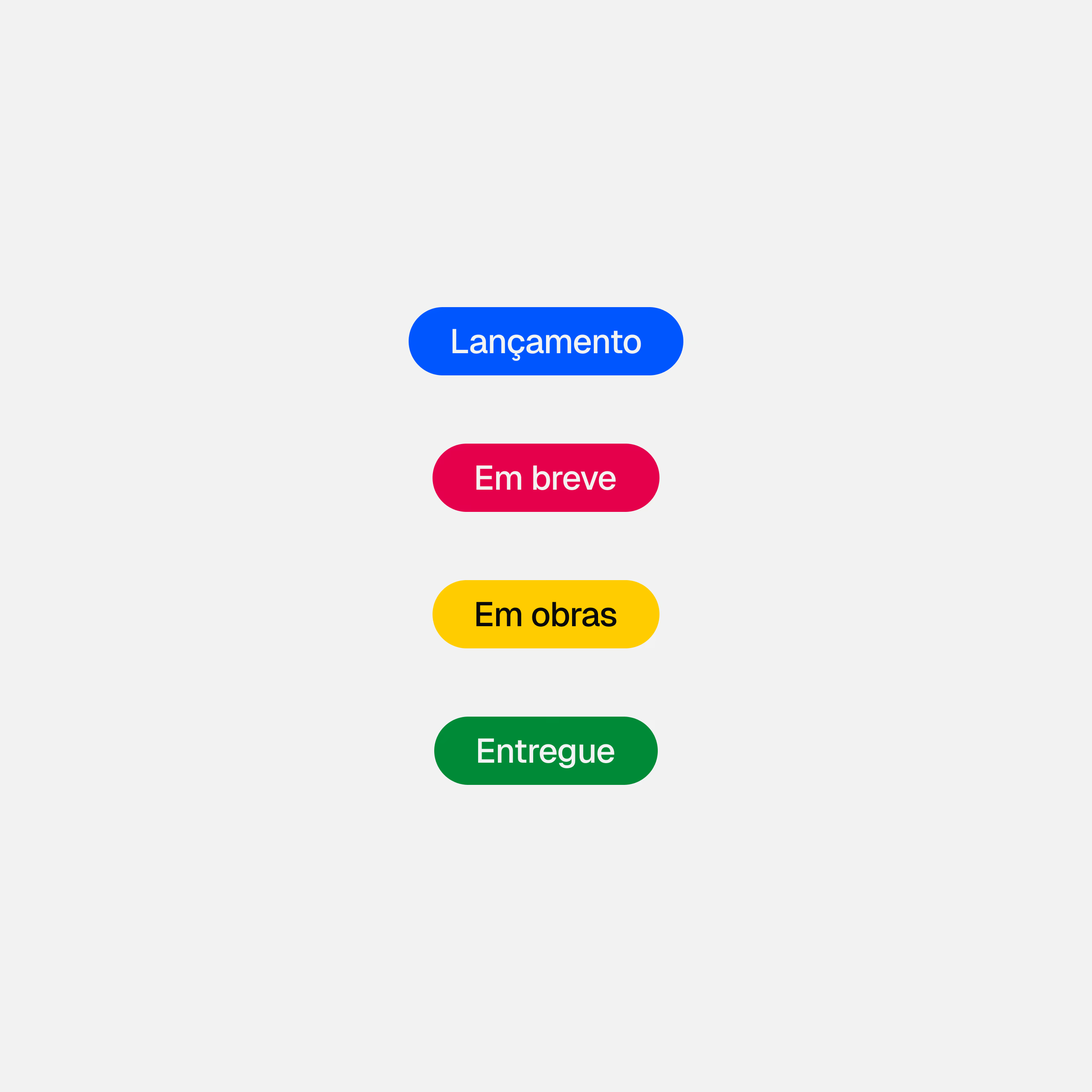
A project page still needed to feel connected to the property it represented and clearly belong to Constrentin’s website. Instead of bringing the full identity over, the design treated it as an accent layer. Buttons, icons, hover states, and labels could take on the project color, while the rest of the page stayed within the site’s own palette.
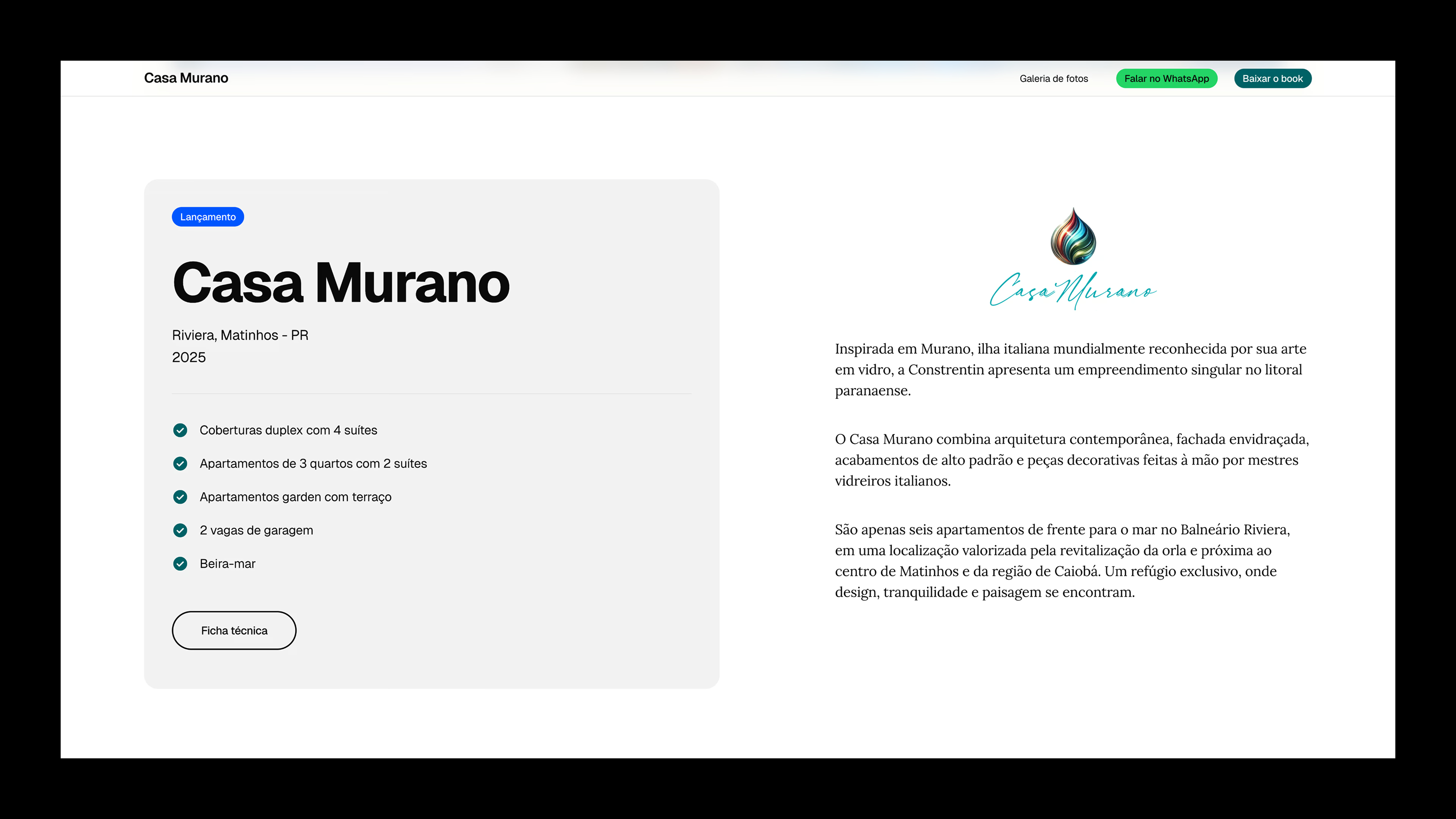
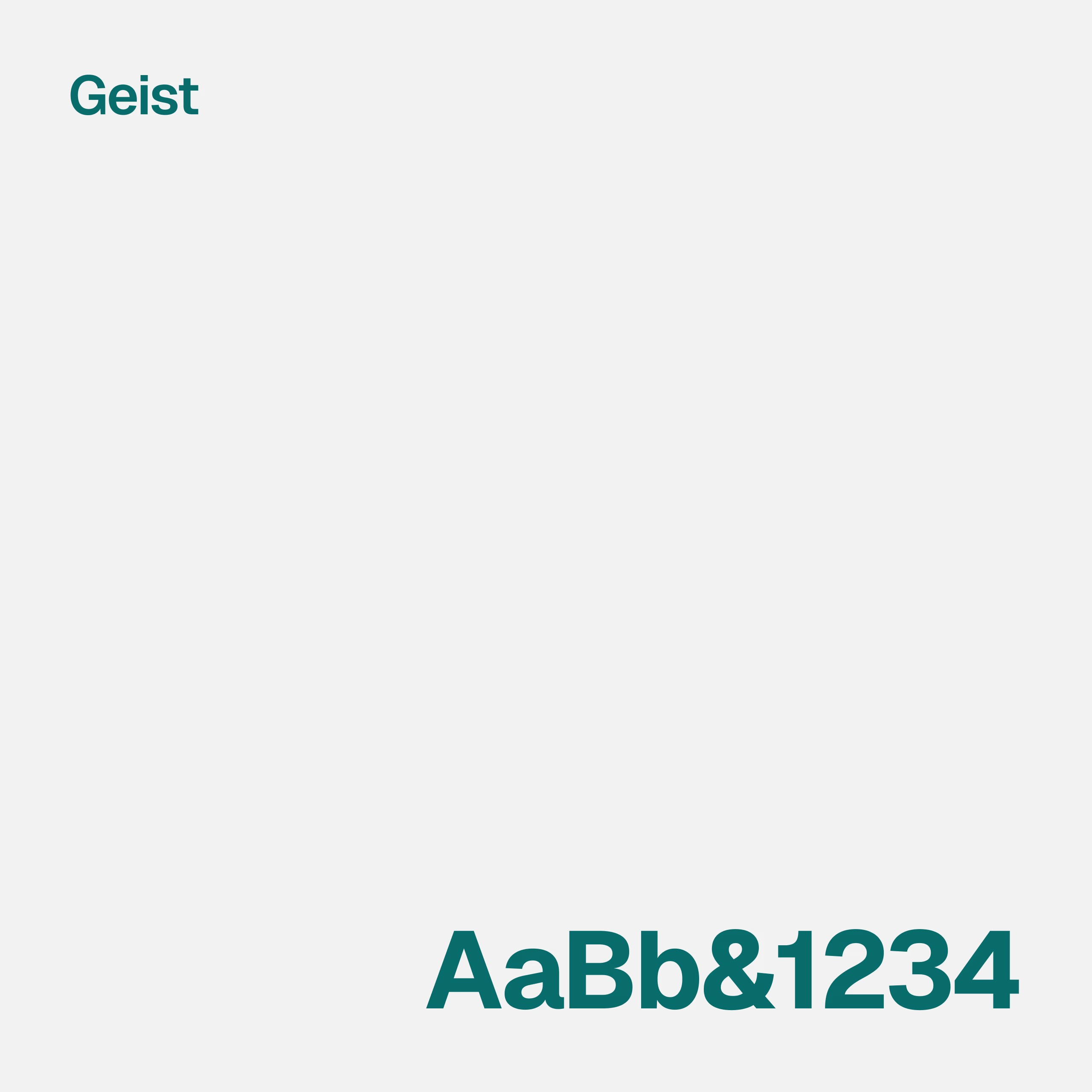
Geist was chosen as the primary typeface across the entire website.
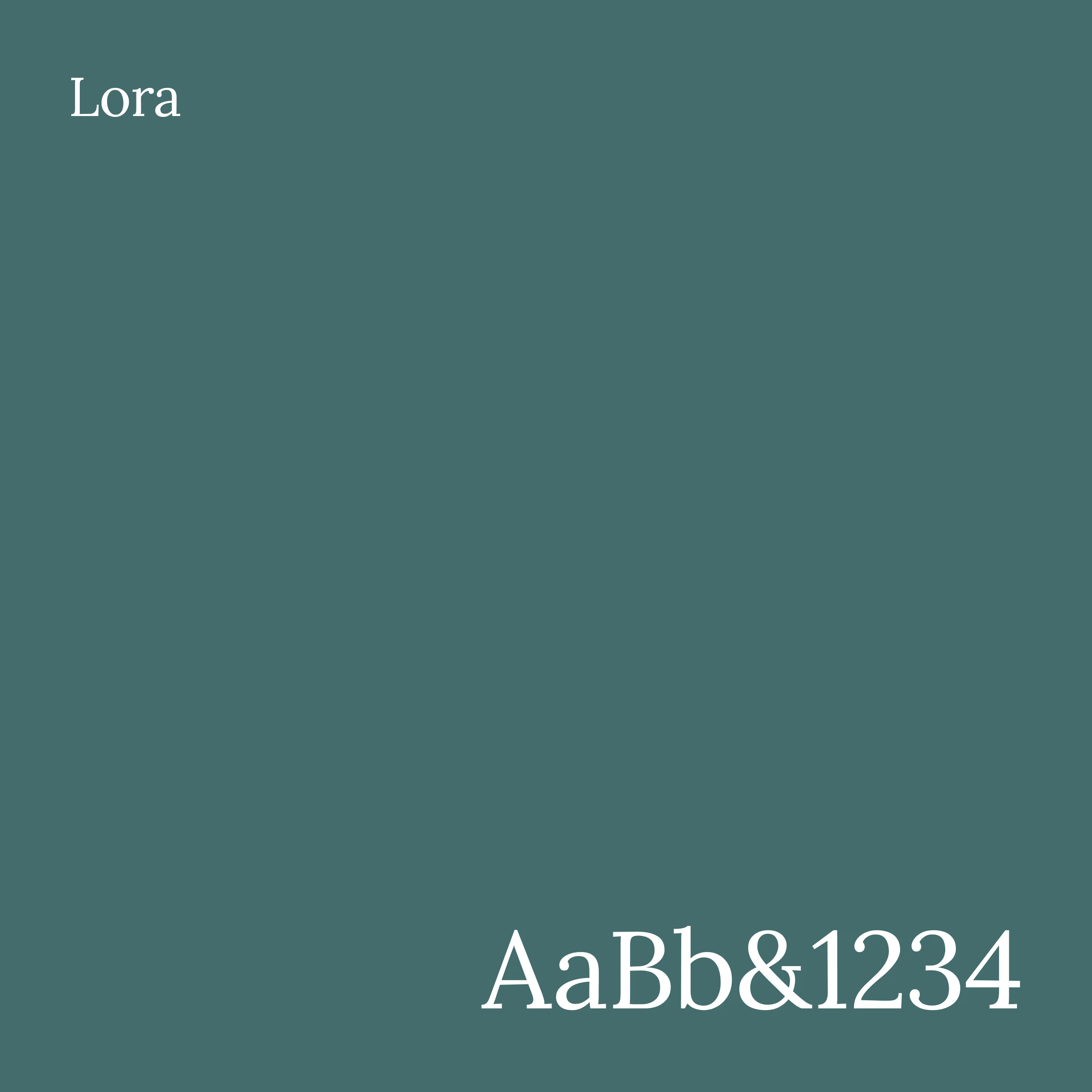
On development pages, Lora is reserved for marketing copy.
03. Handling a large volume of content
Layered content
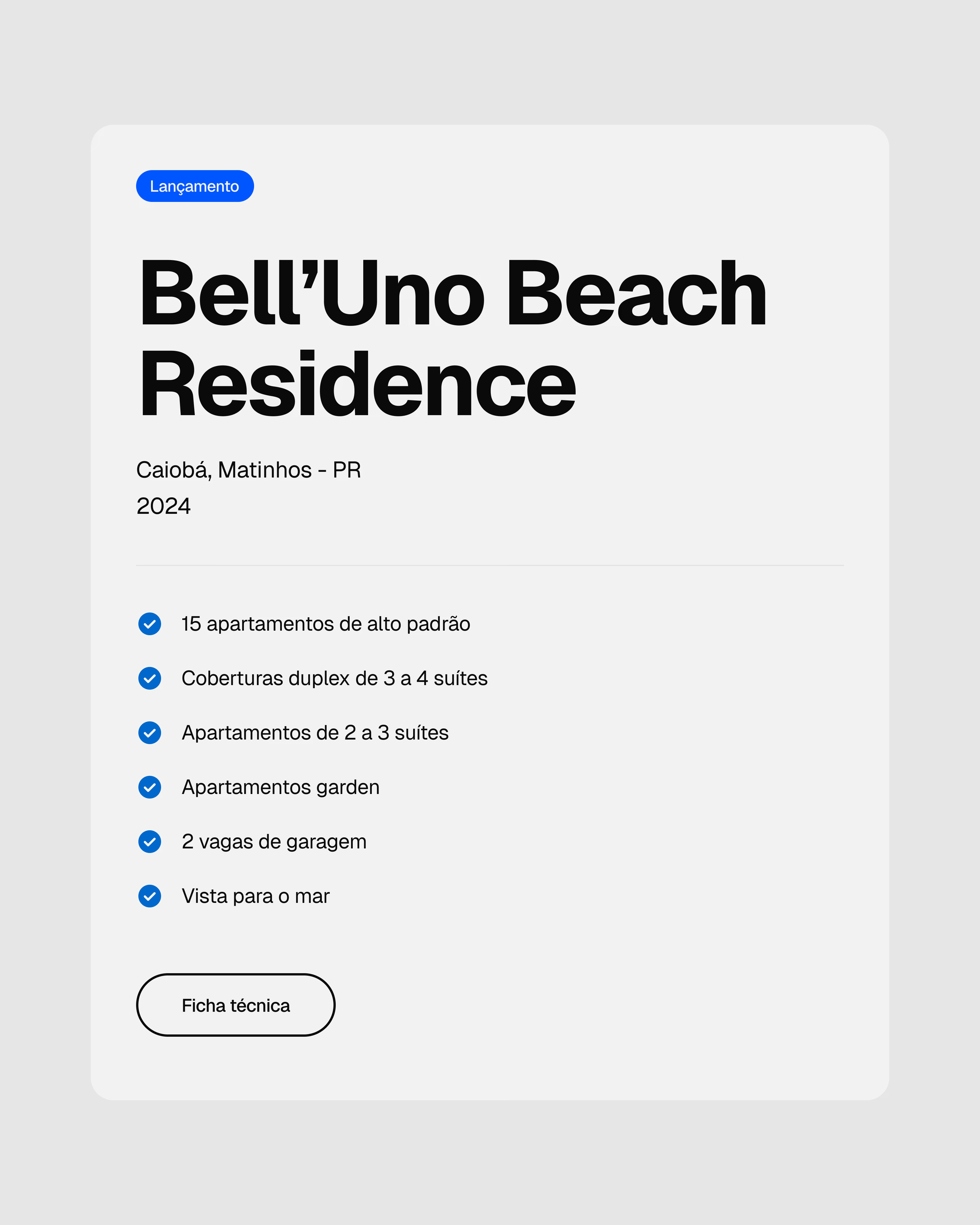
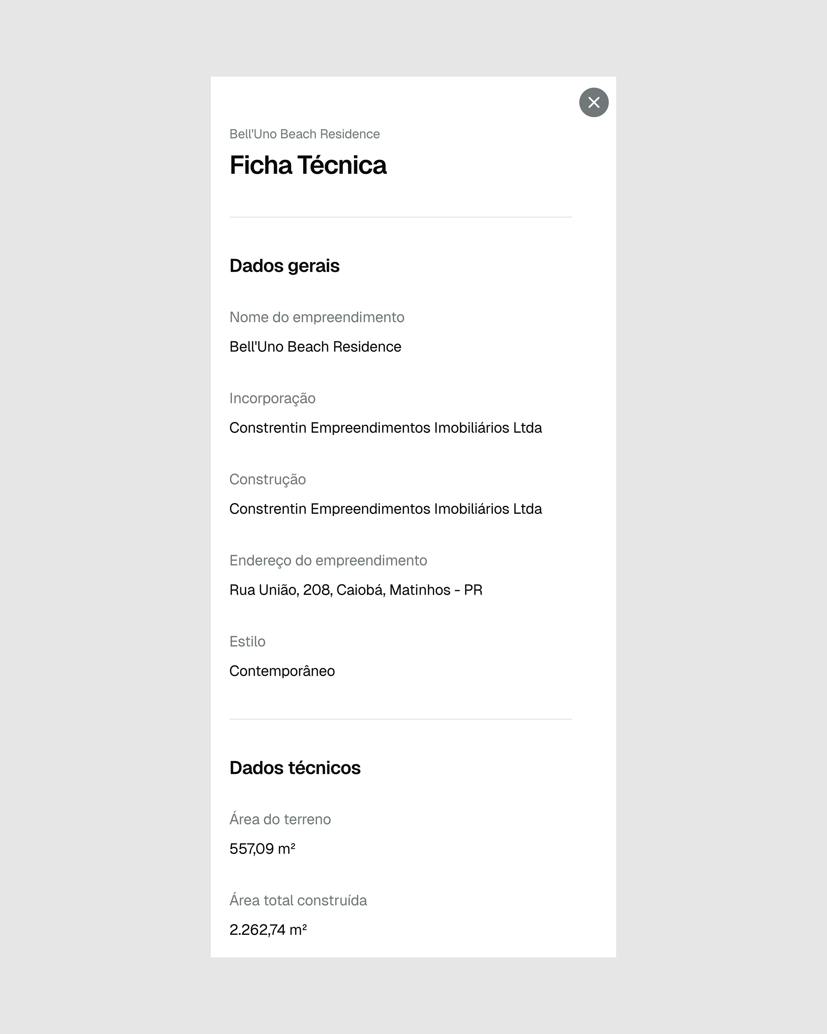
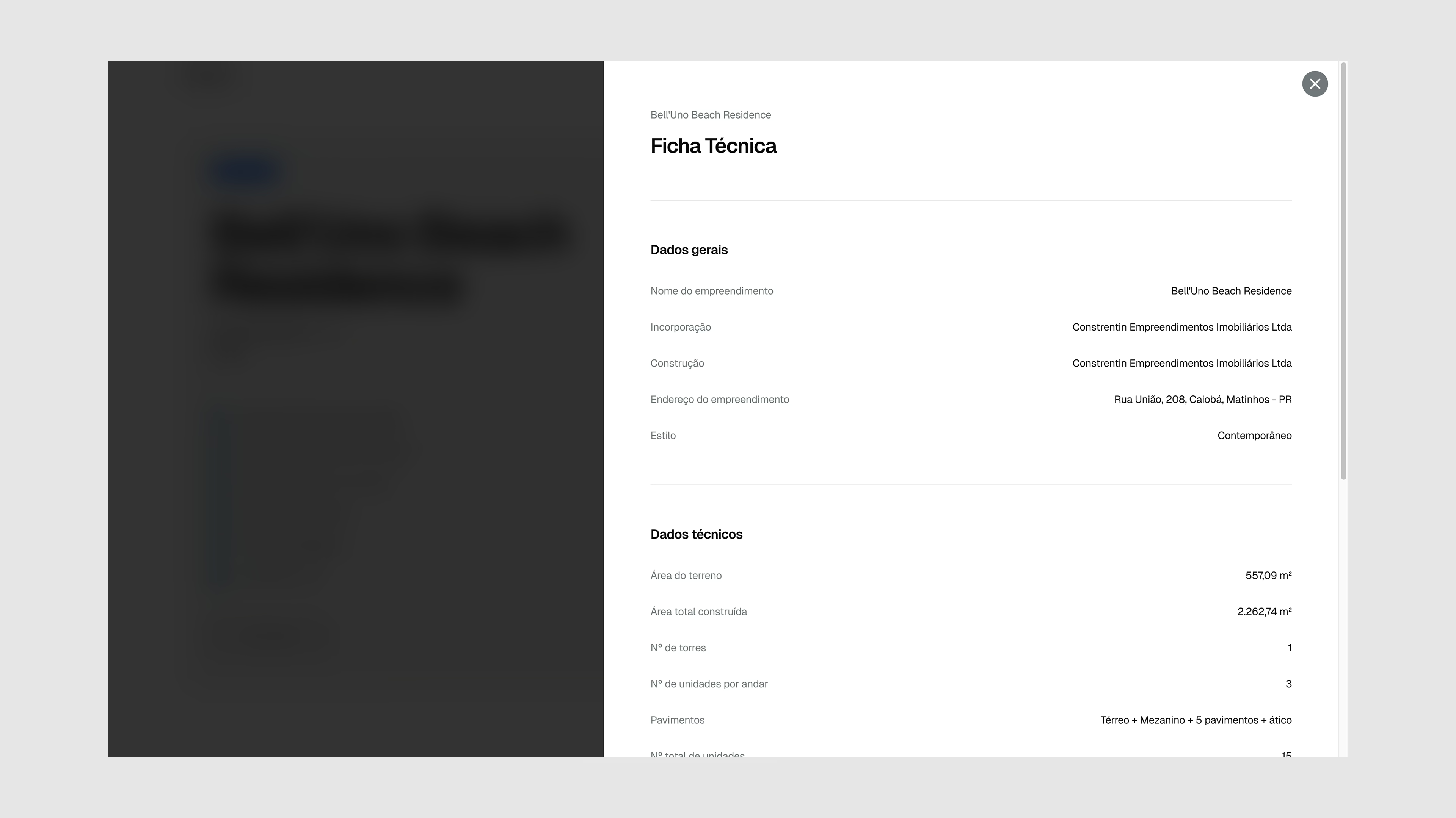
Development pages had to bring together technical specs, amenities, photo galleries, floor plans, and highlights in one place. The key was deciding what to present directly and what to reveal through interaction.
Core content remained visible, while additional detail was organized through interactive elements suited to how it would be explored: carousels and sliders for browsing, tabs for comparing options, and modals for taking a closer look.
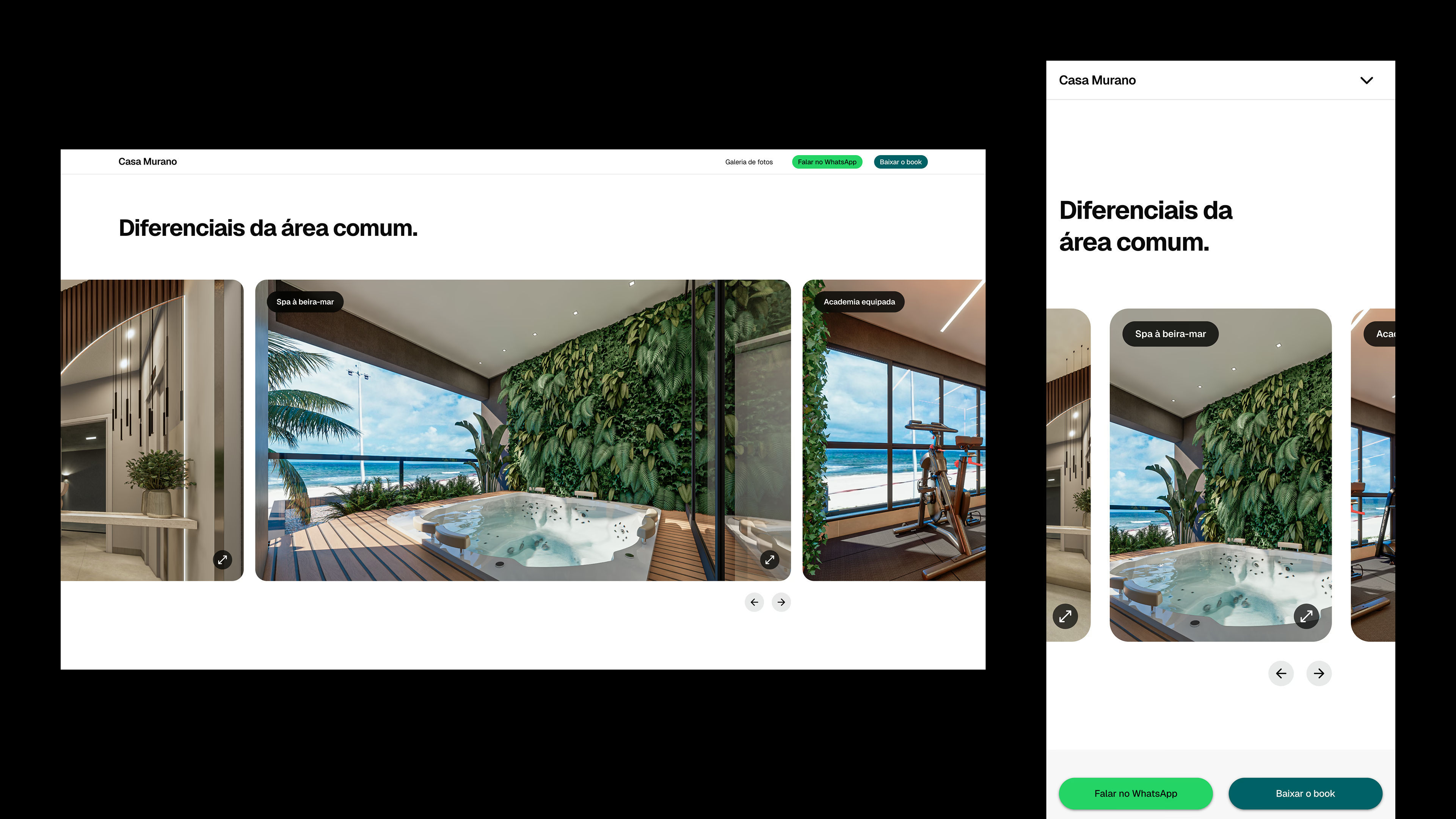
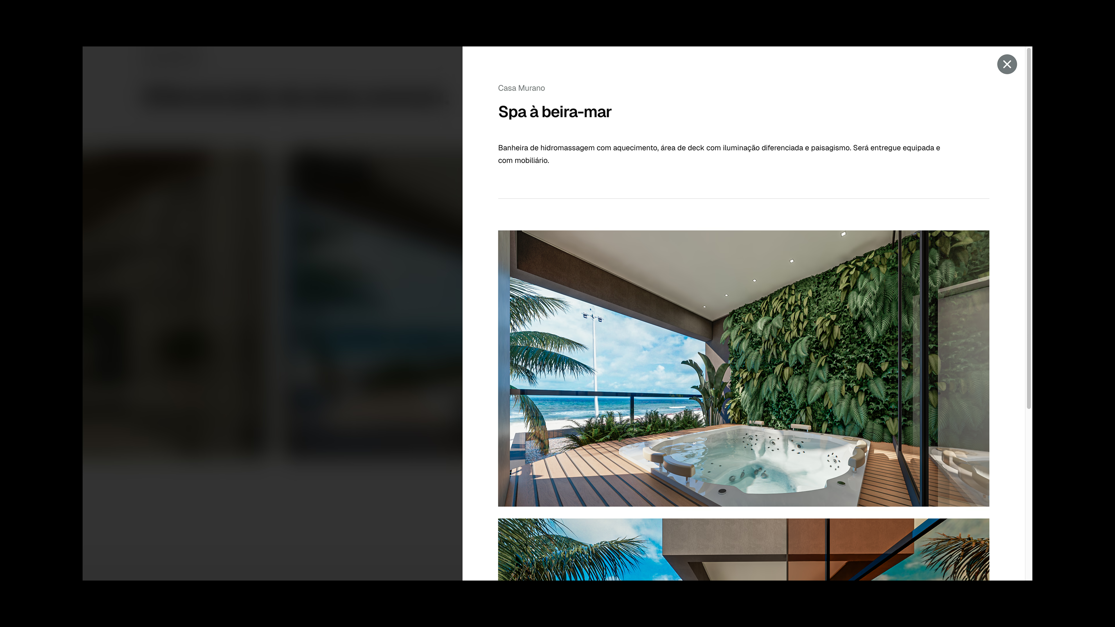
Common area amenities can vary in the number of photos and level of detail they include. The section introduces them through titles and preview images in a compact carousel, and selecting one opens a modal with its description and full photo set.
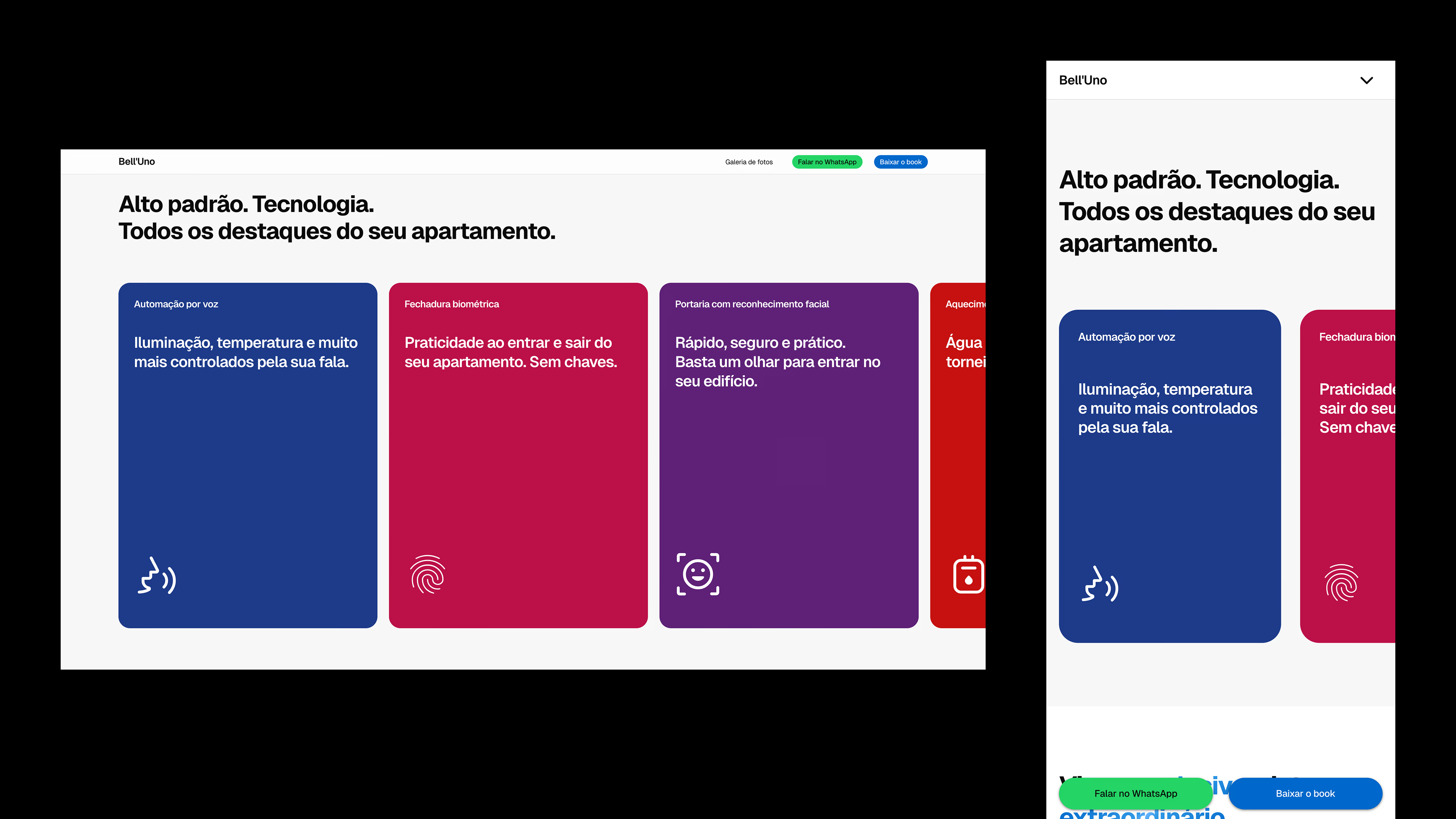
Highlights are shown in cards with an icon and a short description. Background colors can be set individually, including colors outside the site’s main palette.
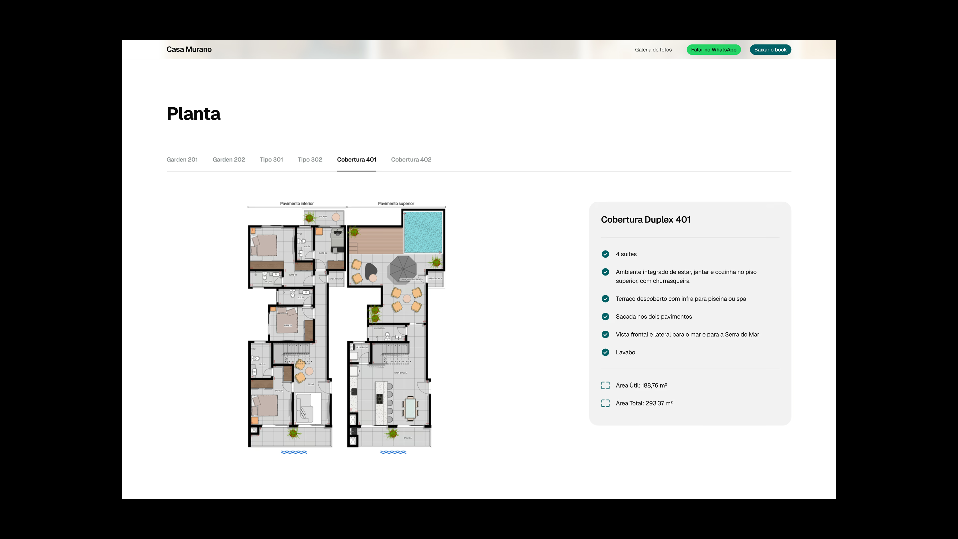
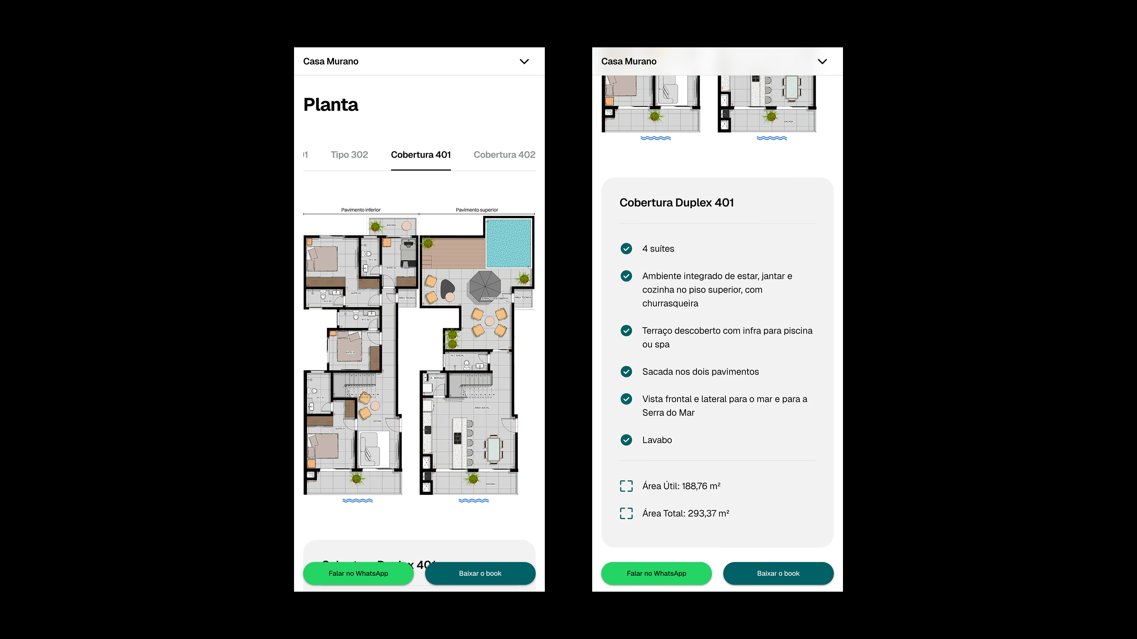
Tabs organize floor plans for different units so their layouts, features, and dimensions can be compared.
04. Dynamic assets, navigation and scalability
The photo gallery
Photography is what most visitors look for first. Before exploring floor plans or reading about amenities, people want to see where they might live. That made the photo gallery the most demanding part of the development page, both to design and to build.
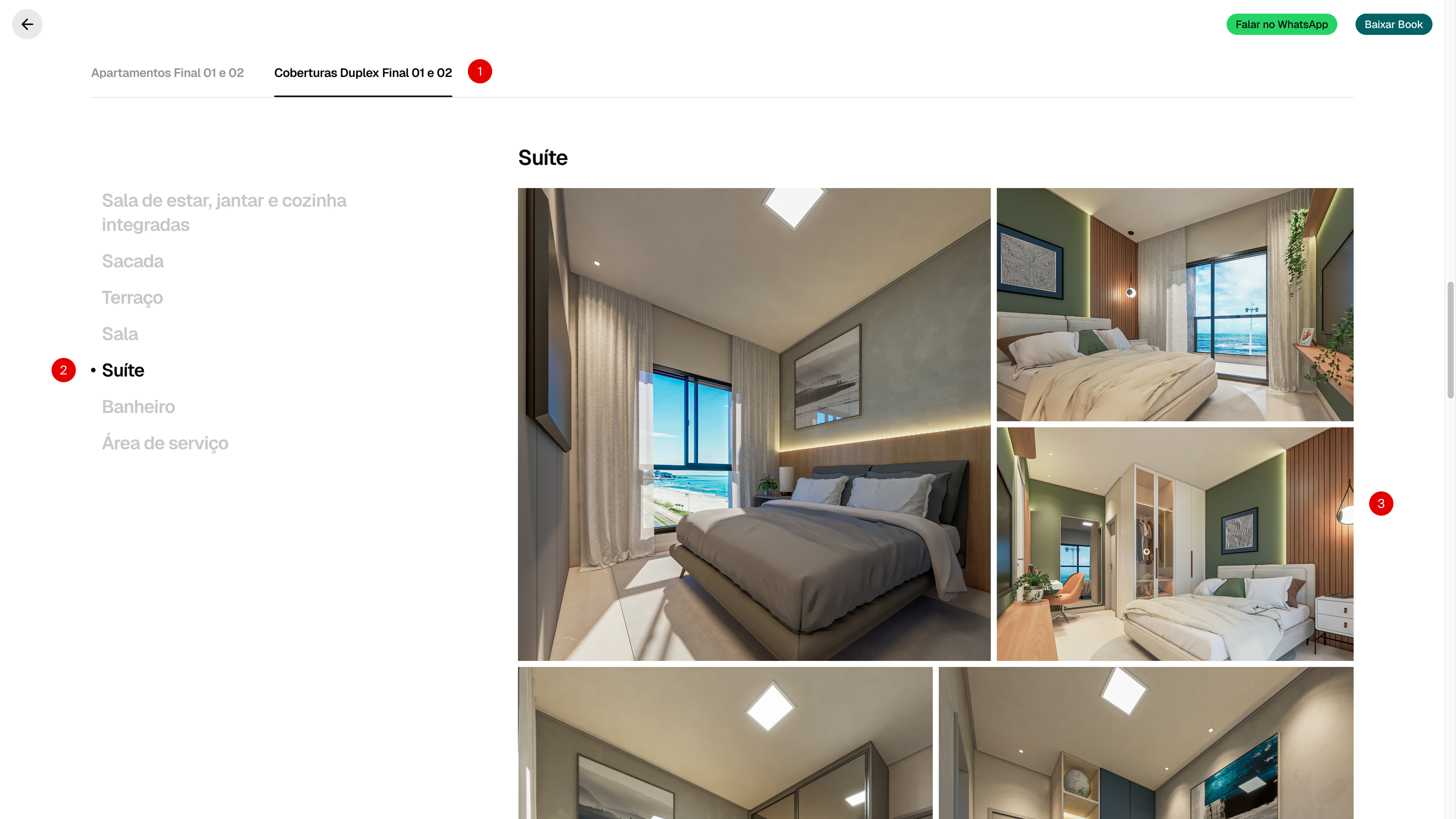
The gallery section previews photos by unit using tabs and includes a link that opens the full gallery in a modal. The sticky subheader also keeps a shortcut available throughout the page for those who want to start with the photos or return to them later.
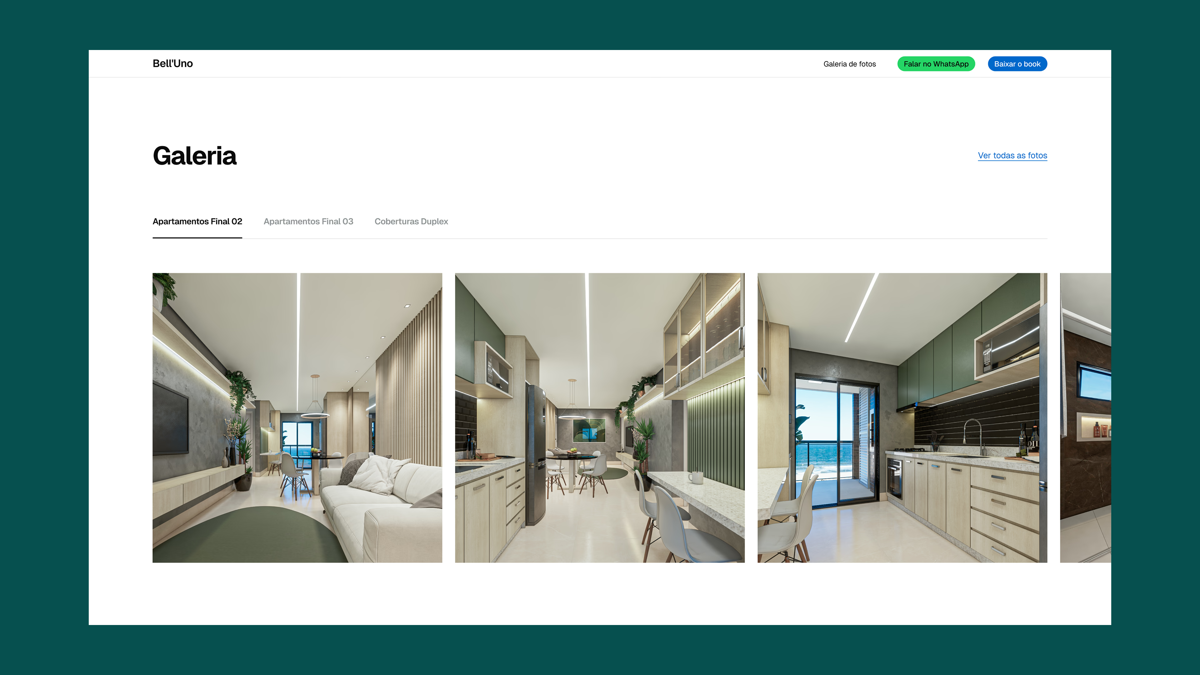
Inside the modal
A single development could have dozens of photos spread across multiple units, each with its own set of rooms. The modal mirrors that structure so users can keep track of where they are as they browse.
Tabs at the top switch between units, while a table of contents links directly to rooms within the selected unit. Both stay fixed as users scroll, so they can move to another unit or room without returning to the top.
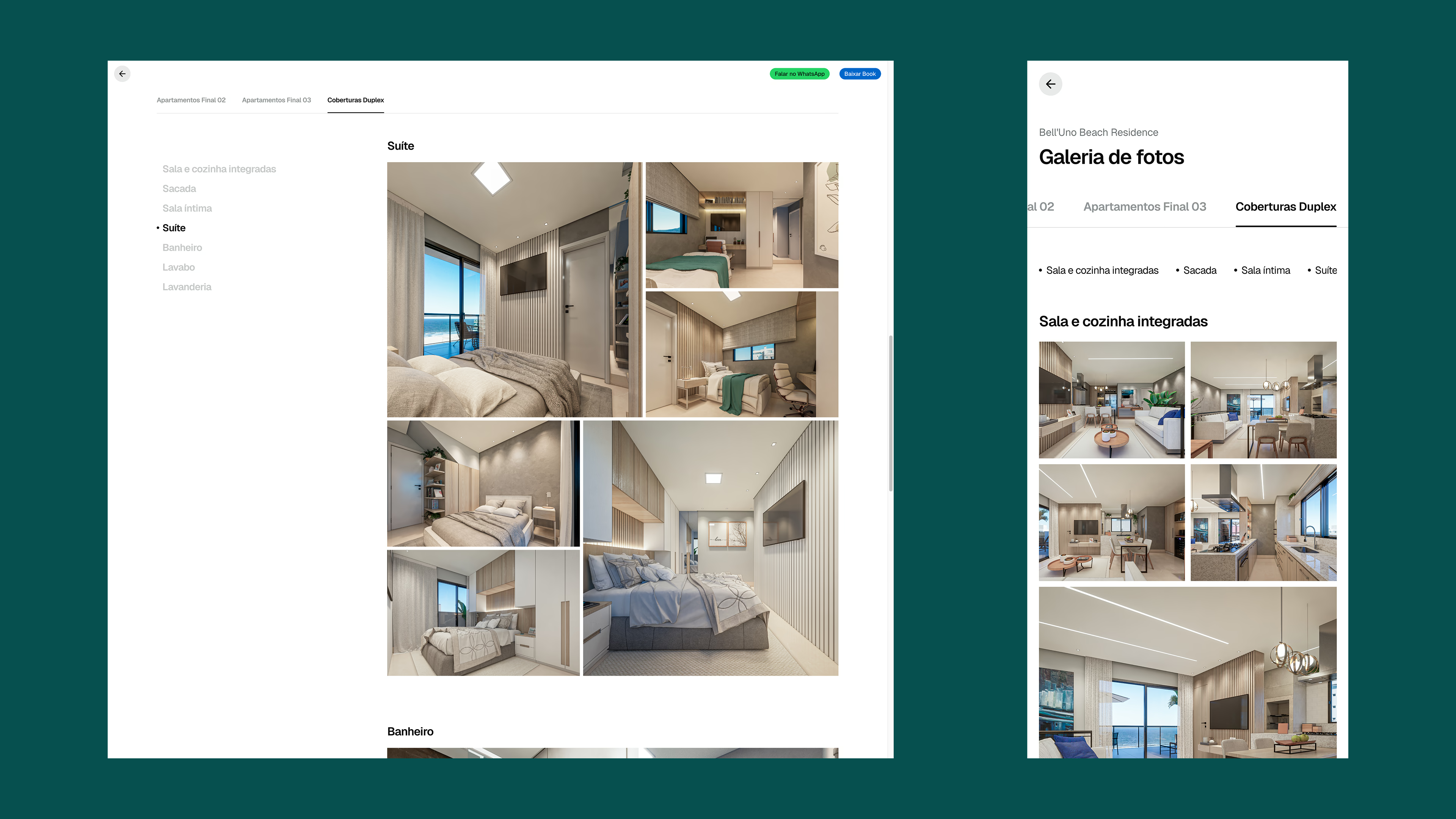
The mosaic
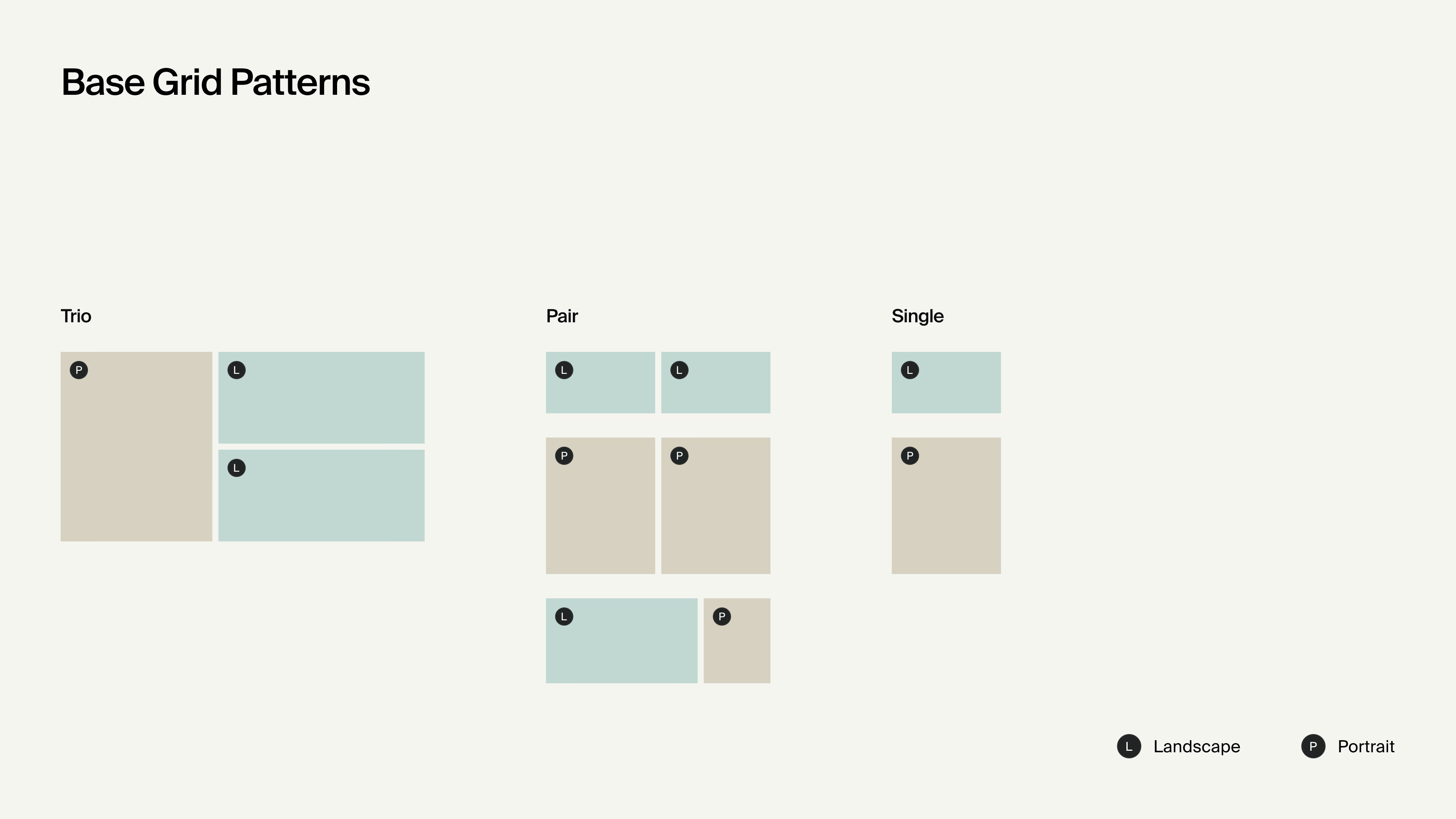
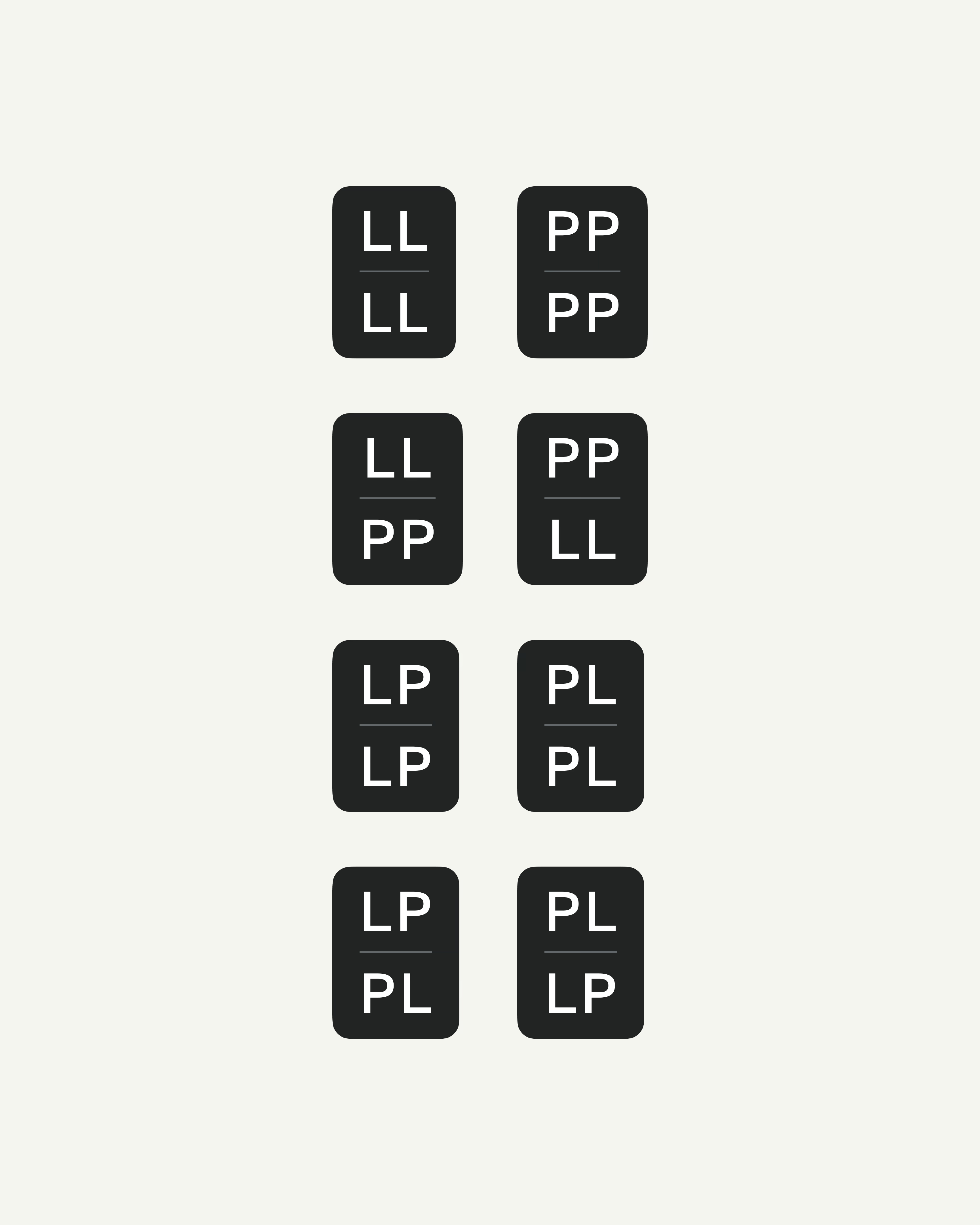
The gallery uses a mosaic to create varied compositions across large photo sets. Images come in different aspect ratios, so a custom grid system groups them by orientation into three base patterns: trios, pairs, and singles. Together, these patterns create a layout that adapts to the available photos without manual arrangement.
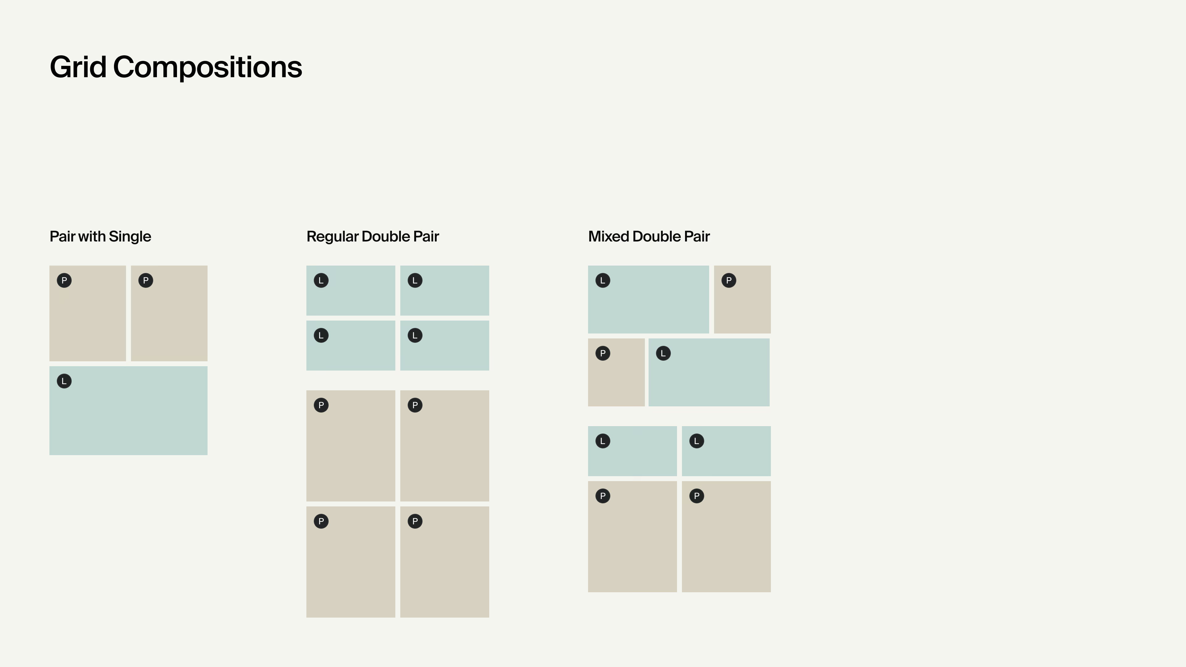
The system then assembles these patterns into larger compositions based on the number and orientation of the available images. Four landscape-oriented photos, for example, form two vertically stacked pairs instead of one pair followed by two singles.
When two pairs are stacked, the system cycles through eight permutations to maintain visual variety throughout the gallery.
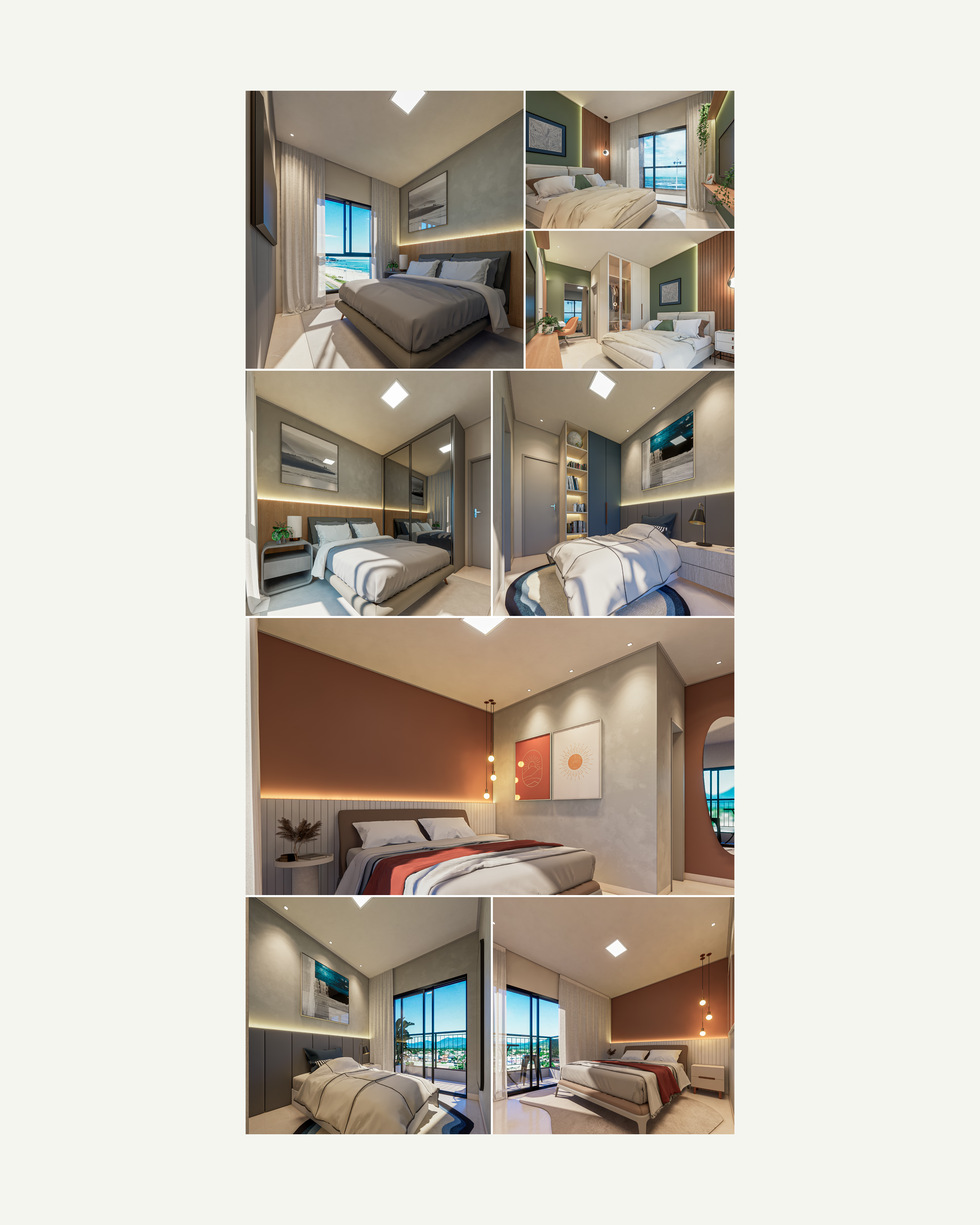
The grid in practice: a room’s image set arranged using the base patterns.
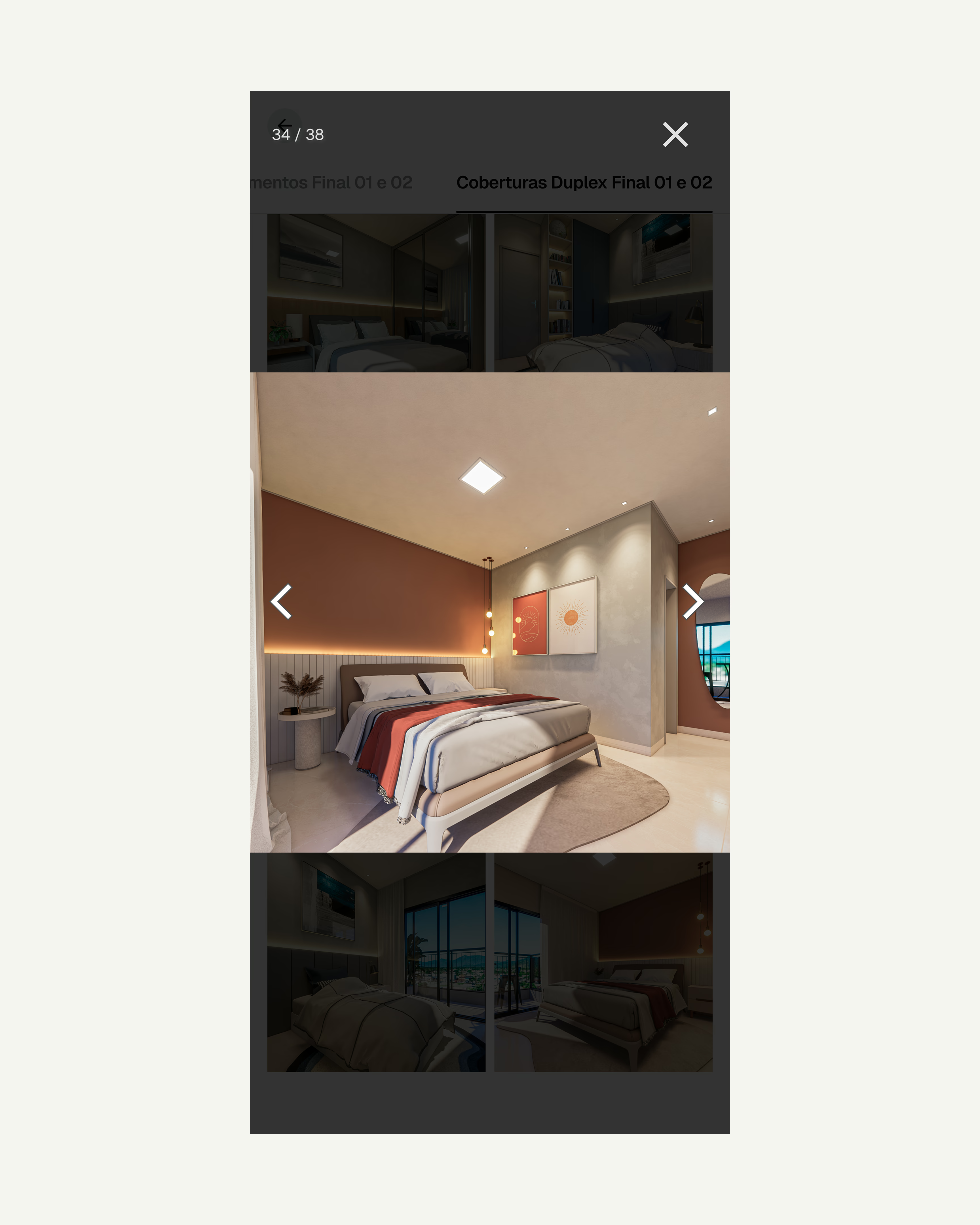
Any photo can be opened at full size while preserving its original aspect ratio, with sequential navigation through the entire gallery, including photos from other tabs.
Keeping up with the content
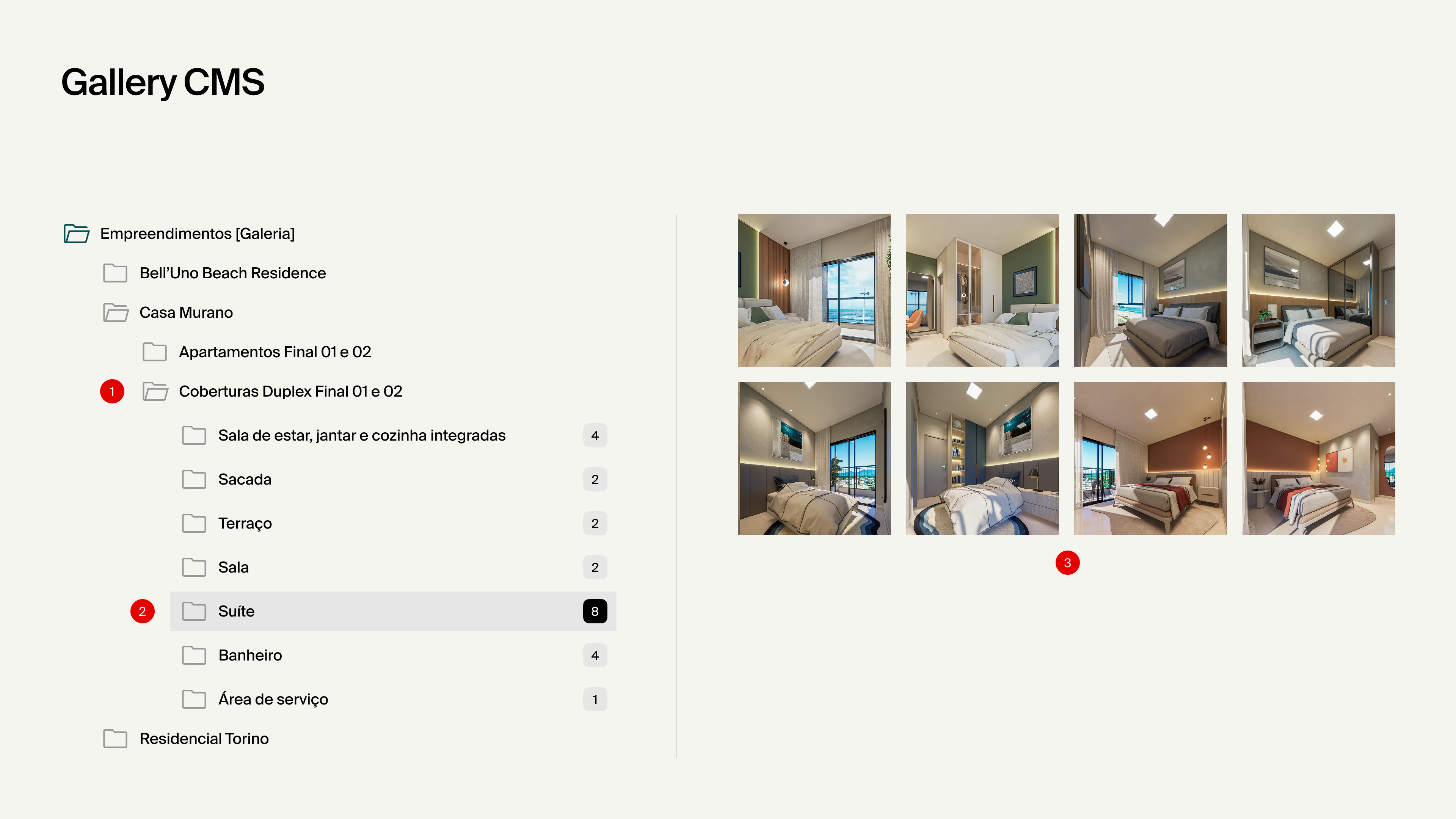
As construction progresses, renders are replaced by photography and new image sets are added over time. Editors maintain this growing library through a CMS hierarchy organized by development, unit, and room.
Unit folders become tabs, and room folders become entries in the table of contents and titled sections in the mosaic. Photos added to those folders are arranged automatically by the grid system, so organizing the library also builds the gallery.
05. Turning the page structure into a system
The content model
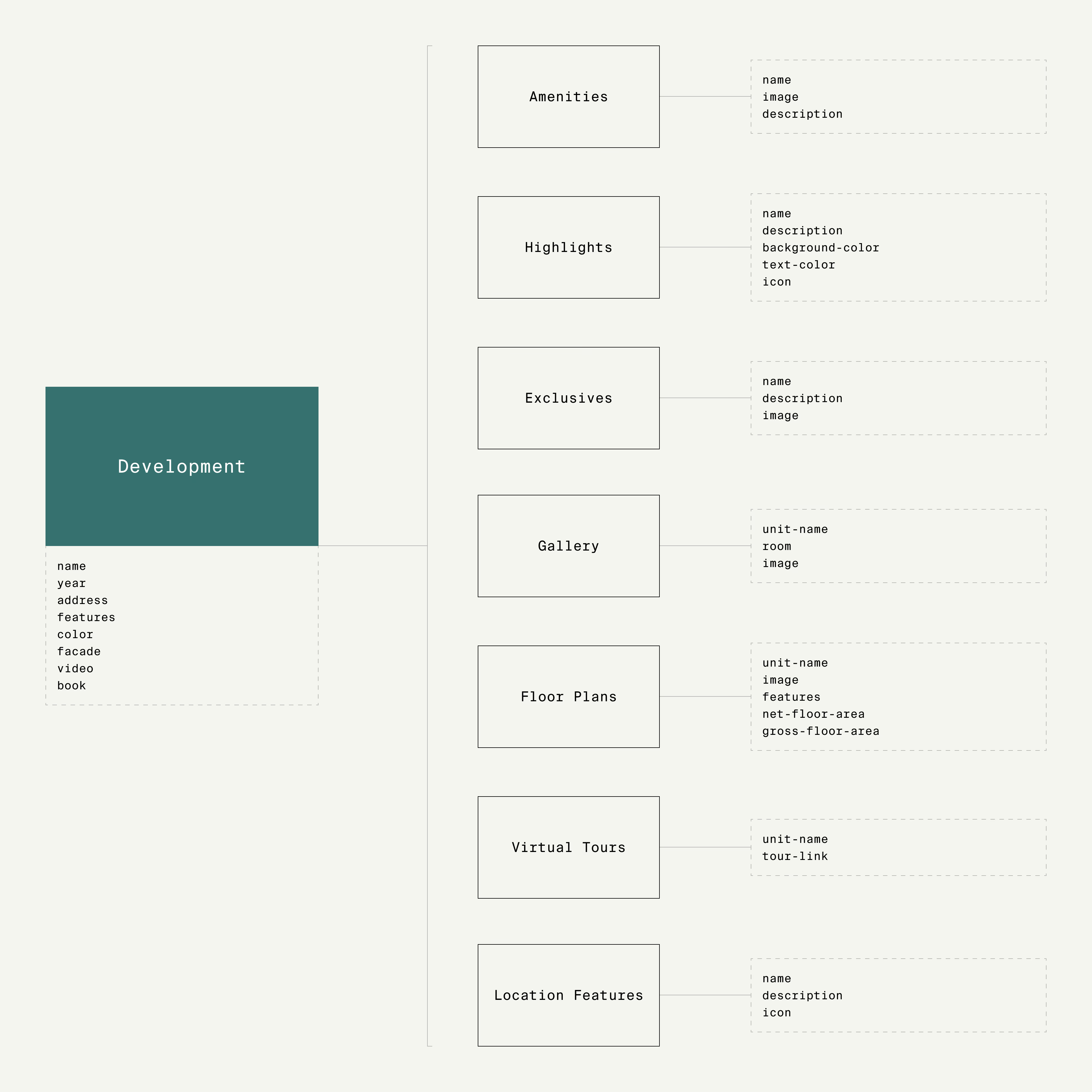
The gallery’s folder hierarchy was one part of the broader CMS structure behind the development page. The modular templates established early in the project defined what visitors saw and how editors managed the content.
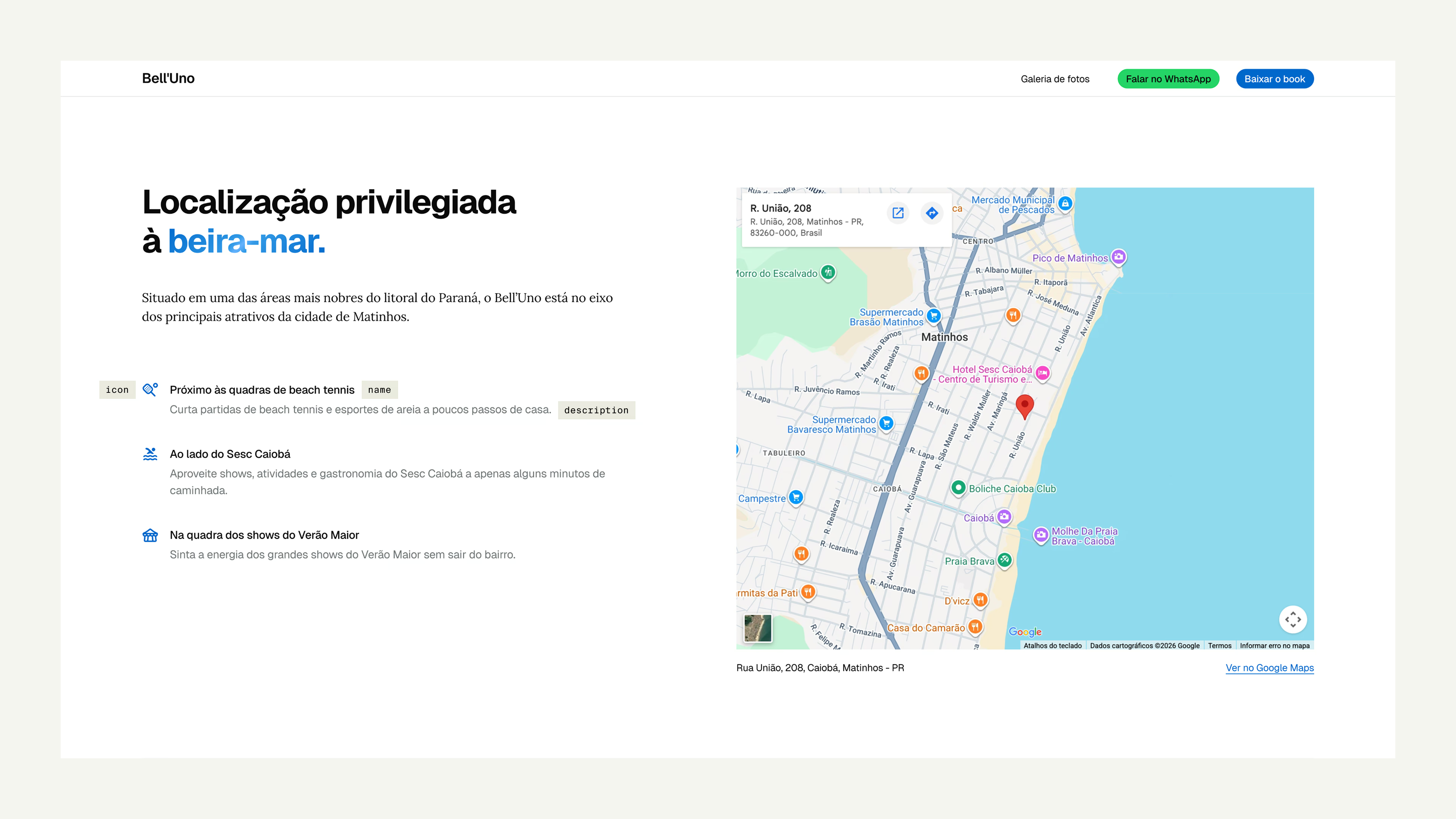
Dynamic sections were mapped as independent content types connected to the development, with fields corresponding directly to what appeared on the page. A development could launch with the essentials and gain new sections when photography, videos, or virtual tours were ready to publish, all within the same underlying structure.
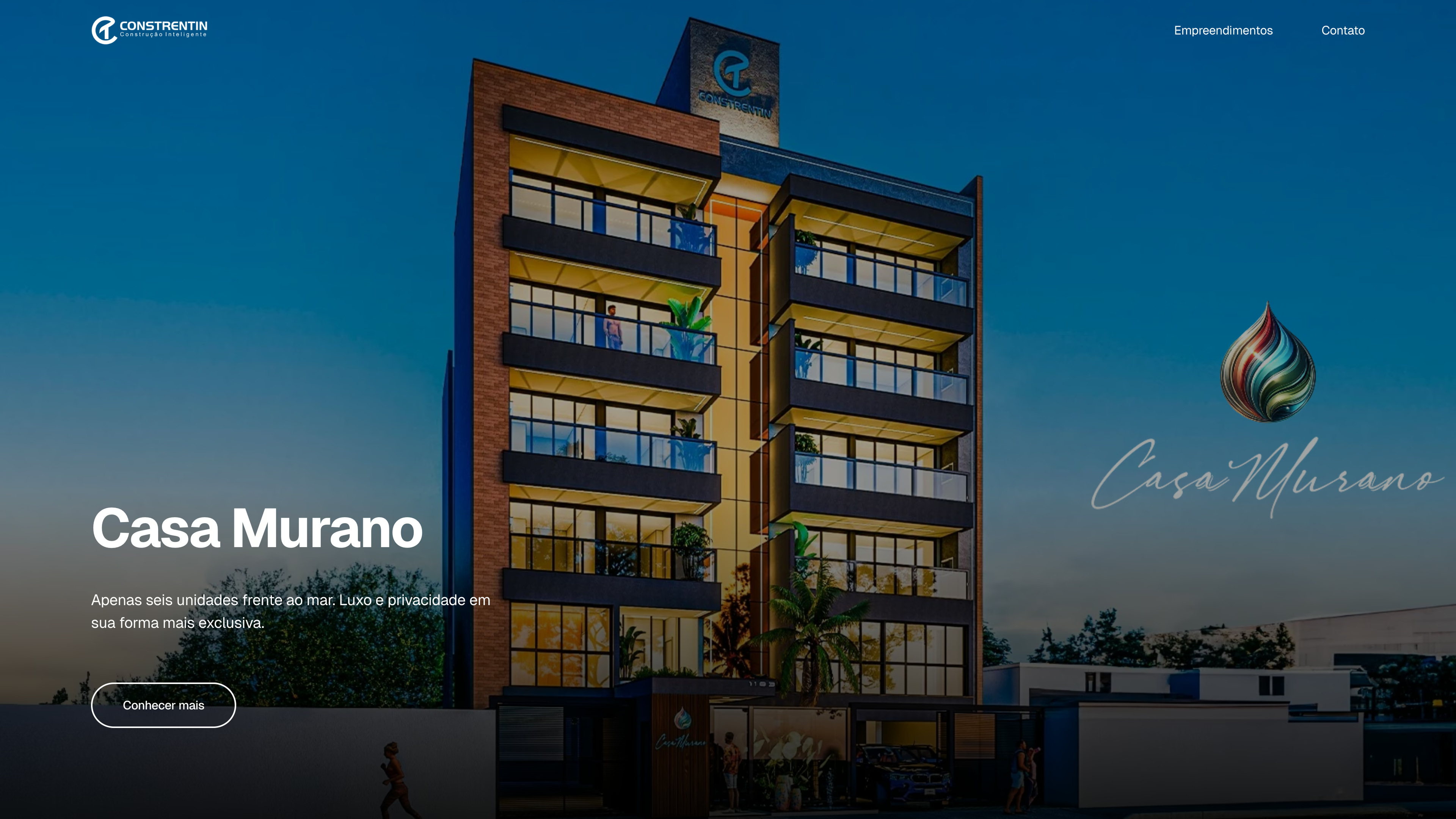
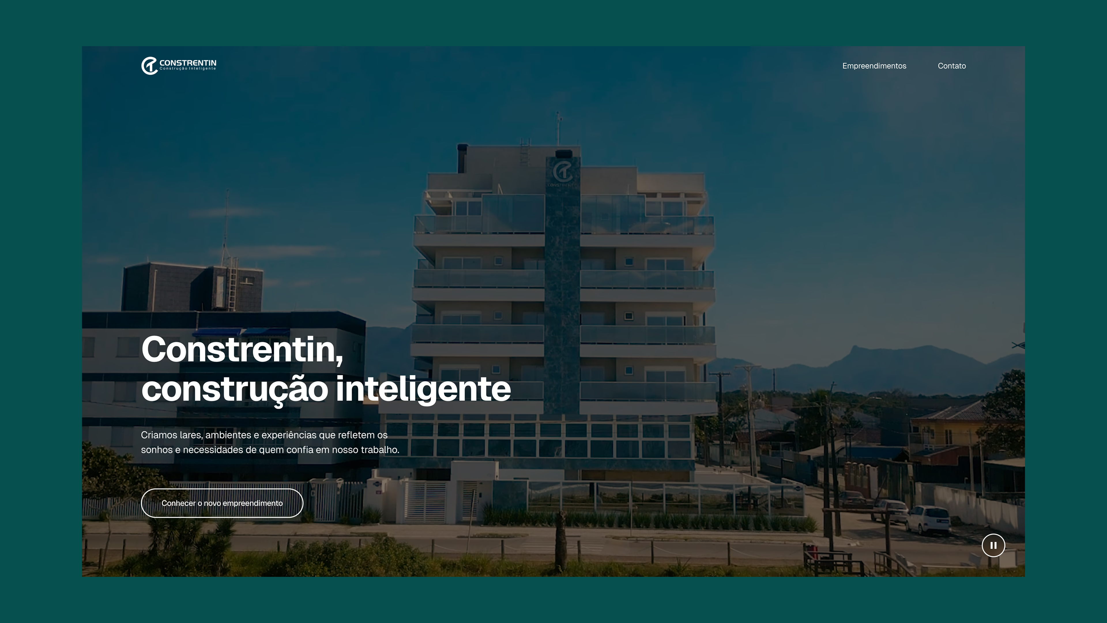
Reusable homepage heroes
The homepage hero could feature whichever development best matched the company’s priorities. The focus might be a new launch, a completed building, a construction update, or the last available units. Through the CMS, editors could prepare multiple hero entries in advance and choose which one appeared on the homepage at any given time.